
Mobile App
Concept
Spredable
My Role
Completed

The Story
Spredable started as a small project that a close colleague envisioned. Tired of missing features and poor design on current trading apps he was using he decided to develop and launch his own app. After some time, when the structure of the app was mostly clear, I jumped on board to boost the looks and the UX of the app.
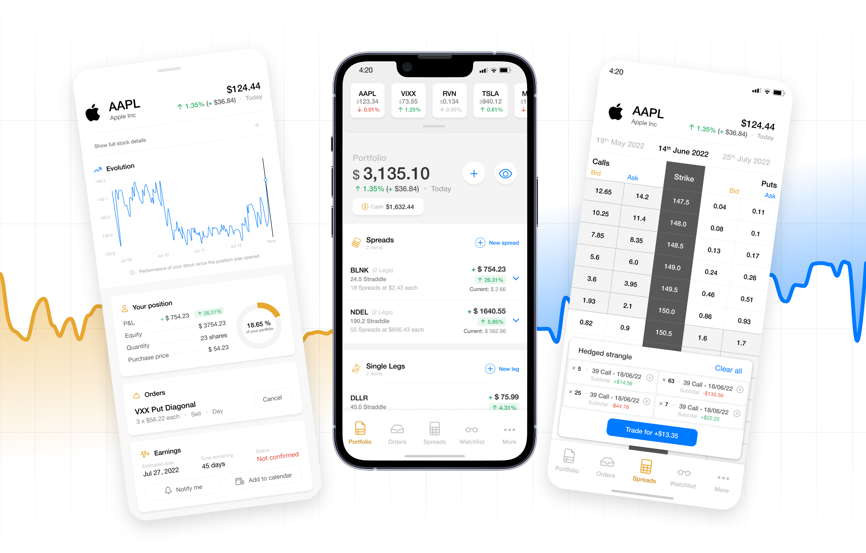
The designs available on this page include a short sequence of screens displaying the basic features of a trading app (such as seeing the position evolution and the portfolio), as well as the actual new features and/or interactions added, which will be explained with more detail.
Glossary
I am myself not very experienced with the trading terminology, which is why I am placing this section for all those who might need a little help too:
- Stock — Stock trading refers to the buying and selling of shares in a particular company; if you own the stock, you own a piece of the company.
- Position — A position trader buys an investment for the long term in the expectation that it will appreciate in value.
- Order — An order is a set of instructions to a broker to buy or sell an asset on a trader's behalf.
- Spread — Generally, the spread refers to the difference between two prices, rates, or yields. In one of the most common definitions, the spread is the gap between the bid and the ask prices of a security or asset, like a stock, bond, or commodity. This is known as a bid-ask spread.
- Single leg — A 1 leg or one-leg trade involves taking a single position in the market. It is one of the basic strategies used in trading.
Design rationale
Disclosure:
I have completely made up the numbers, values and calculations contained in the designs, as it is only intended for mockup purposes.
Portfolio
Displays the classic view of a trading portfolio.

Stock slideshow
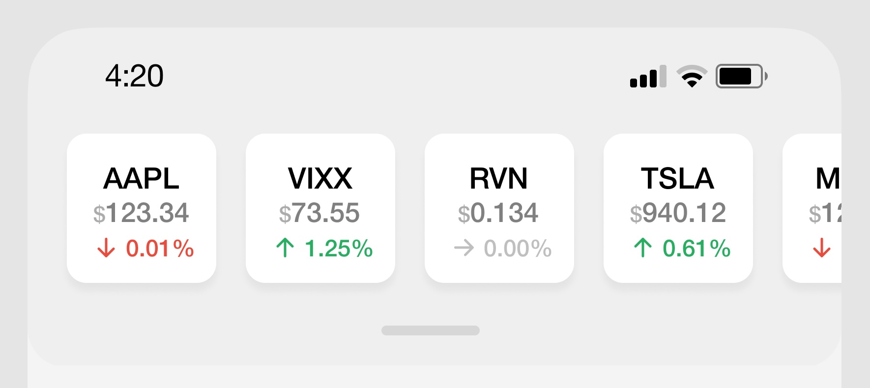
This part acts as a reminiscence of the traditional trading apps. There’s this common idea of constantly seeing a flow of the most recent stock updates. As we thrive to come with a different approach our decision was to make this optional and allow seeing more of it by dragging down the slideshow by using the tiny grabber underneath or allow hiding it by pushing it upwards, completely hiding it from the view.
Summary

The current status of the portfolio is highlighted by making it the main figure of the page, at the very top.
The earning/loss updates are placed right underneath in 2 different formats: One indicating the percentage and one indicating the actual value using the preferred currency.
Bubble buttons on the right are actions that affect the portfolio itself:
- Plus: To add something, either to top up the portfolio, create a second different portfolio.
- Eye: To view the current status of the portfolio.
Elements
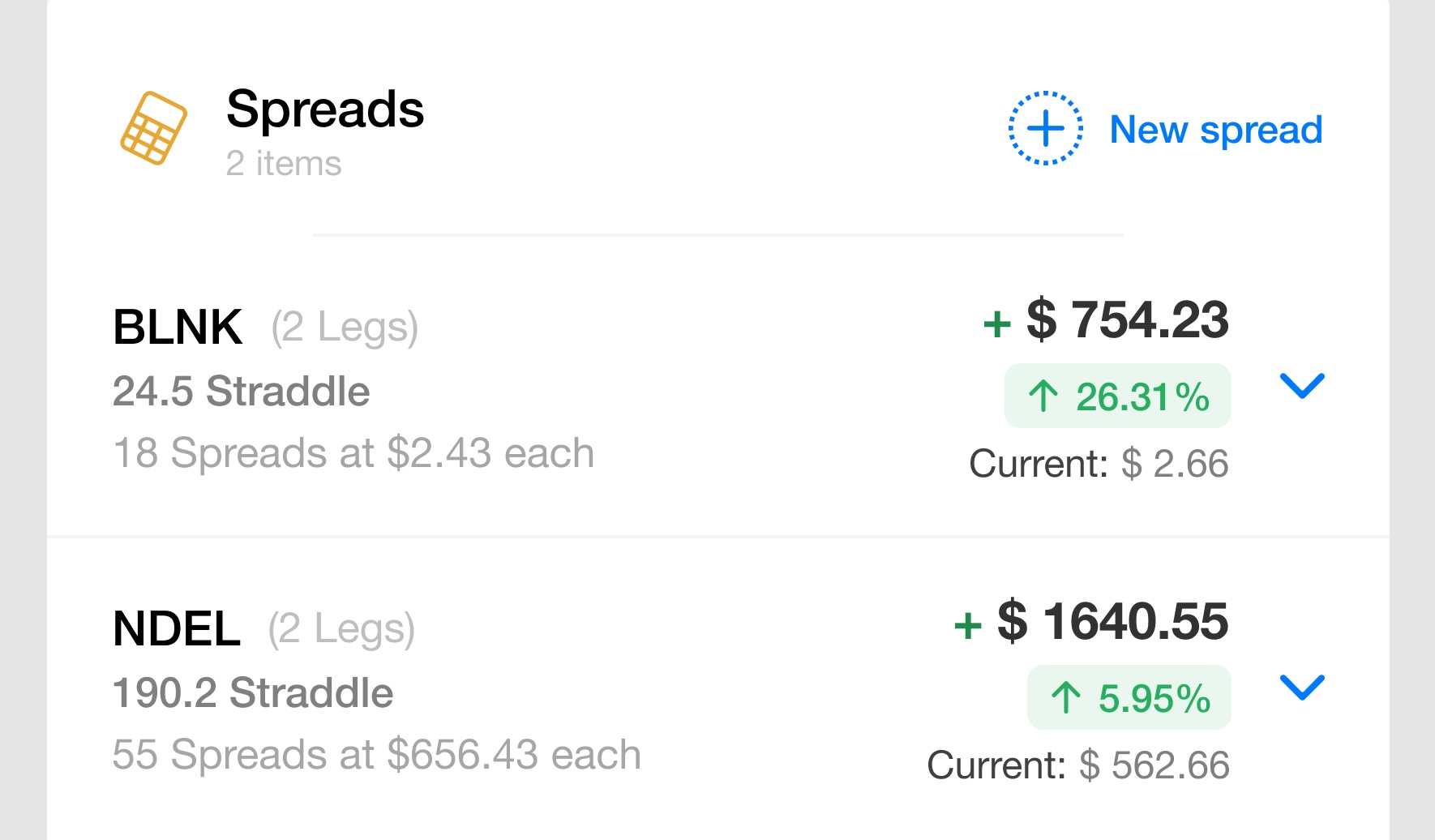
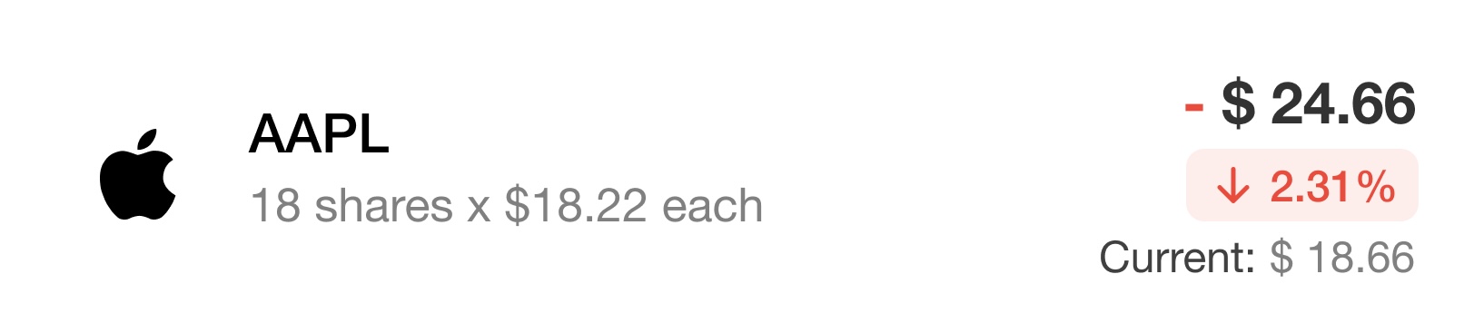
Spreads, single legs and stocks are the main 3 elements that we can work with in this app.
All three elements share common items. They are all formed by:
- An identification symbol on the left side plus a subtitle that summarizes what is the item about. Spreads, for instance, indicate how many legs it contains, its kind and, price per individual spread. This patterns is extended to legs and stocks.
- A summary of earnings on the right side, where, as in the portfolio section, the numbers are reflected in different formats. The main element highlights the actual earnings/losses, while the colored tag below indicates its percentage and a color according to the value: red for losses, green for earnings.
Swipe logic
All three elements, Spreads, Legs and Stocks, are prone to be worked with quite quickly due to sudden changes in the market. Hence, quick actions are needed. Instead of having action buttons for each item on the list (which will also clutter the view), we decided to go for gestures.
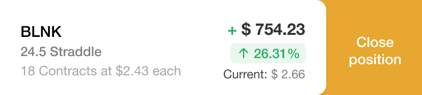
Swiping from the right edge of the screen reveals the "Close position" action, while swiping from the left allows modifying the Order. Actions have been setup at opposite edges of the screen instead of opening a contextual menu with two options to prevent adding an extra tap to access the next screens. Remember speed is key in these actions.
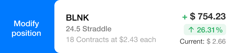
In both cases, the information contained on the list element is still fully visible while revealing the action.
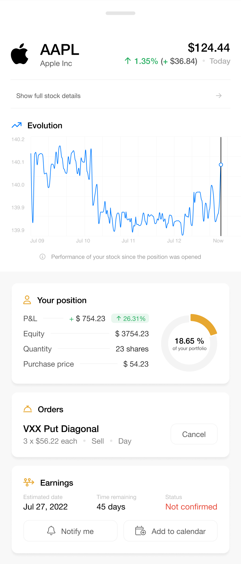
Stock details
The next screen is quite simple, both in content and in UX, as it is meant to be purely informative about the stocks of the selected symbol.
It holds relationships with the Orders screen (not shown in this rationale) by displaying the orders where the symbol is present in. Besides, it also contains the exact time when an order gets resolved.
Visually, it continues the style of the Portfolio, although with some changes. The position summary, Orders and Earnings elements do not stretch to the full width of the page, as they do not call for swipe gestures. Instead, they have been separated in individual islands, each advertised with a different although same-coloured icon representing the section's meaning.
Spreads
When selecting a symbol to trade with, the classic bid/ask spread. The view of this screen rather respects the well-known distribution of elements of the table, in order to not disrupt the know-how of an experienced trader. We need to take into consideration that this app can be used by new or experienced traders.
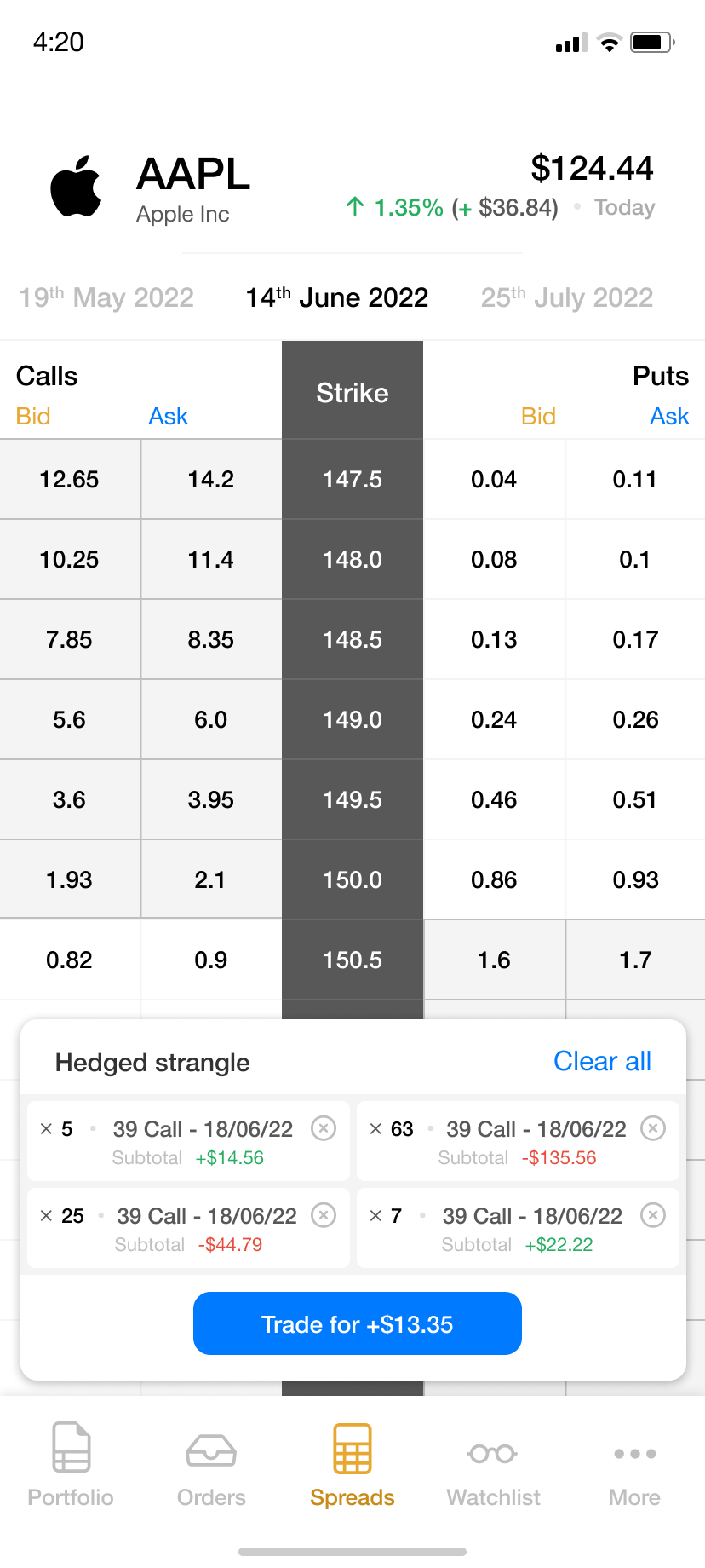
Hence, given these restrictions, we could only play with the style of the table, making differences a bit more prominent, e.g. between Bid/Ask areas, Strike section, etc.
Where we did have a word was on the order display. When tapping on individual cells from the table, an order gets built, and a specific spread is created. This order can only consist on (minimum) 1 to (maximum) 4 elements, all of them different.
The presented solution takes multiple factors into account for both placement and size:
- The symbol's information needs to stay visible at all times, in case of sudden changes.
- The Bid/Ask spread is the main action point, therefore the more area we keep visible, the better, as less scrolling is involved.
- When tapping on a cell and adding an item to the order, this needs to contain all the information related to it: Amount, type, date and subtotal. These items also need to be able to be removed from the order.
- The app's navigation needs to stay accessible.
Like this, the order can be placed by keeping all the restrictions in sight.
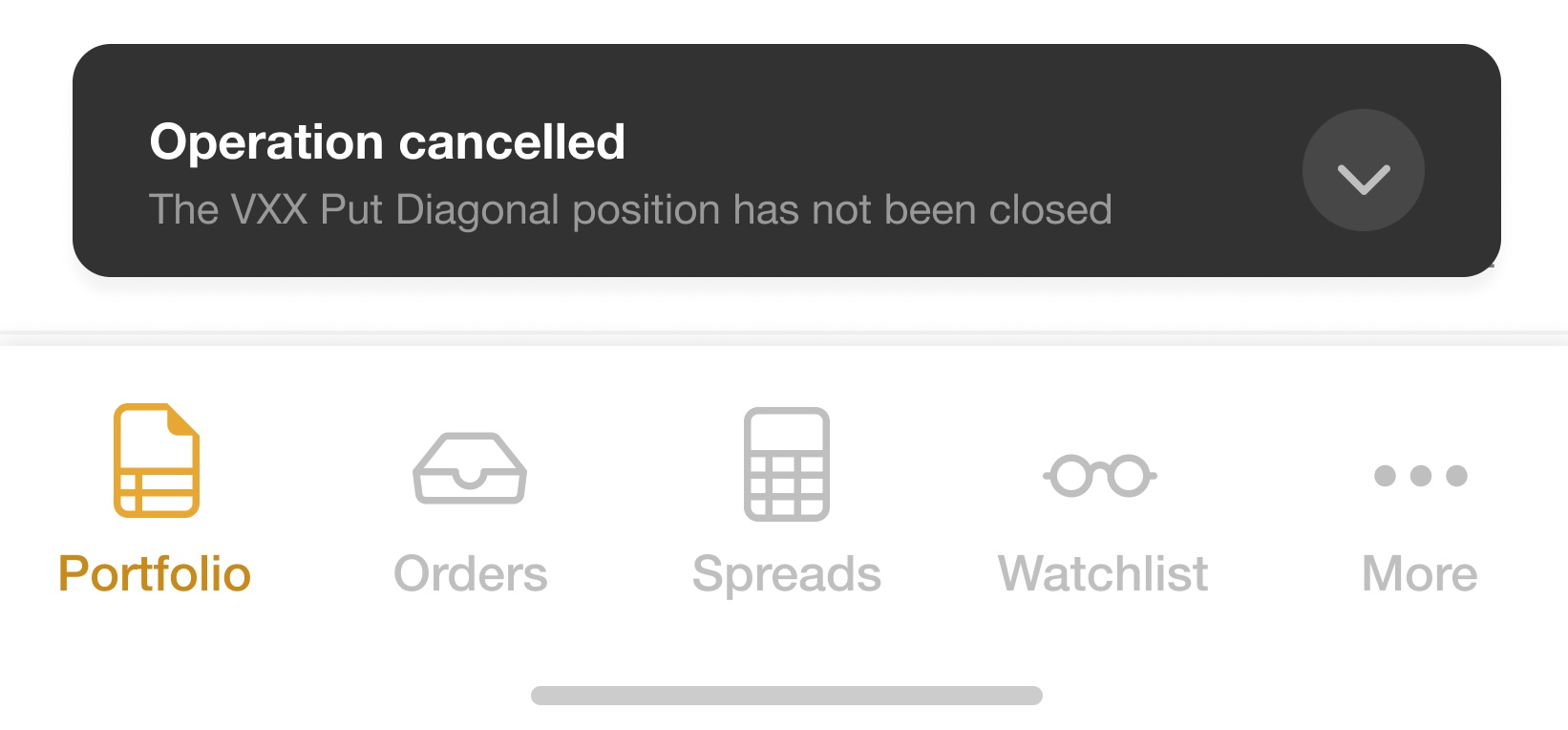
Close position
This is the immediate UI displayed after closing a position through the contextual menu of an element of the portfolio. In this case, a Spread position is being closed.
Main aims of the UX of this screen include:
- Focus on quickness: Simple and useful buttons to quickly increase/decrease value of selling.
- Collapsed mode, short lists, etc. to keep vertical space tiny and avoid the need of scrolling.
- Red/Green color code as visual cue for loss/gain. Also, icons at the beginning of each important section to attract the sight from so much text and numbers.

The top of this screen indicates this whole view is draggable and, hence, temporary. When dragging it down, the whole process is cancelled, and this very action, being a vital activity inside the application, properly notified using a high-contrast notification (dark gray over a white environment).
Buying/Selling area
The screen starts with a reminder of the action that is being carried out: Closing a position. Besides, the exact Spread that is being managed is named.
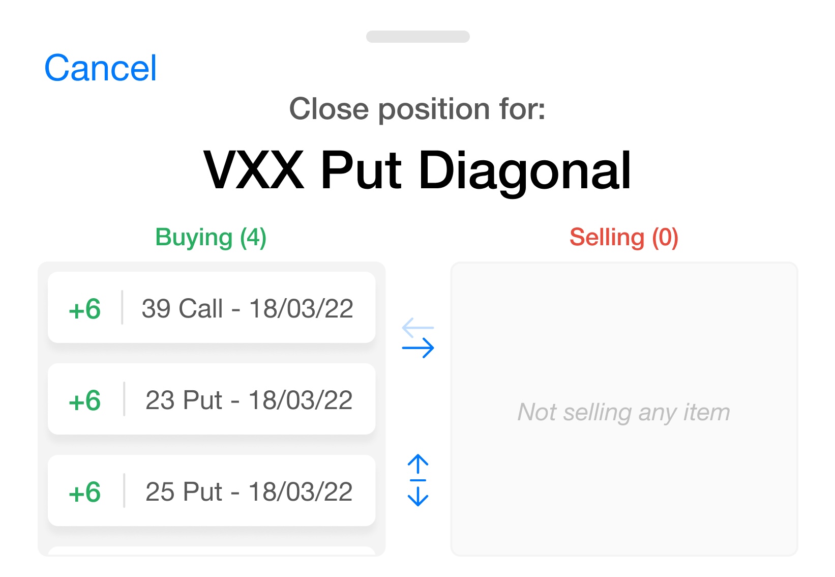
Right underneath, the actions of buying or selling contain the number of items affected. In this case, 4 items are being bought. A full list of 4 elements — not picked randomly, there is a maximum amount of 4 elements by default in these kinds of transactions — would have lengthened the screen too much, therefore, it has been limited to a more restricted view that shows that there are more elements inside the scrollable list by displaying 2-3 items and half of the next one. Besides, the number of total items is also displayed at the top of the list, right next to the title, to avoid confusion between 3 and 4 items.
In the cases where all the items need to be seen, they can be revealed by tapping on the vertically-stretched arrows icon (the bottom one), easing comparison amongst lists when needed.
Price shortcuts
Changing the price of the transaction might also need to be done in a rush. In order to make clear the field can be edited, the value has been placed inside a grey area.
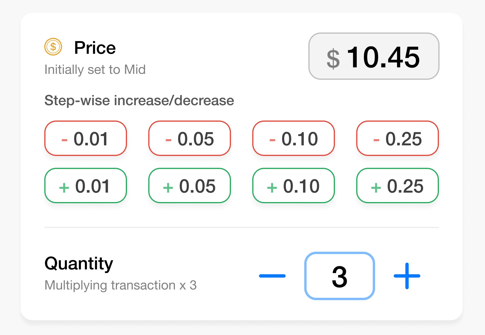
Right below, we find the step-wise increase/decrease area, whose main aim is avoiding having to use the keyboard when the value needs to be quickly changed. By just tapping on a button, the price value automatically increases or decreases. The initial chosen values for these buttons range from the minimum amount the price can change (0.01) to a reasonable maximum (0.25).

