


Completion time
Am I the right person for you? Let's see:
... and what cannot
Not good at everything, what can I say!
The Story
I was thrilled when a long-term client approached me with a new project called "App Themer". Having worked with them on several successful app development projects in the past, I knew this would be another exciting opportunity to create something truly innovative. My client is experienced in developing apps that involve calls and communication tools, including previous collaborations such as the "Call Master" and "Call Announcer" apps.
This time, the challenge was to take customization to the next level by providing users with the ability to customize the backgrounds and dial buttons when receiving a call from a contact. The project was divided into three parts to ensure a smooth user experience:
- Phase 1 - Onboarding: First, we focused on creating an engaging onboarding process to introduce users to the app's features.
- Phase 2 - Main app: Next, we developed the theme app itself, which allows users to easily personalize their contact list.
- Phase 3 - Notifications: Finally, we worked on the notifications feature, which while not a top priority, is still an essential part of the app.
In the following sections, the all the parts are described.
My contribution
Throughout the development of this project, my primary responsibility was to oversee the app's user interface and user experience design. Specifically, I took care of the entire UI/UX design of the app's main features, ensuring that they were intuitive, easy to use, and aesthetically pleasing.
I took on the responsibility of:
- Designing wireframes for the whole app.
- Designing prototypes for required parts of the platform.
- Full-scale overhaul of the app's UI/UX, involving a deep analysis of the existing design and identifying areas of improvement.
- Ensuring that every UI element in the app was stylish and accessible to all users.
- Providing quality hand-off to the developers team ensuring that they were equipped with all the necessary information to create the app effectively.
I am proud of my involvement in this project as a UI/UX designer. My contribution has resulted in an aesthetically pleasing and user-friendly app that delivers a seamless experience to its users.
The design rationale
The app's onboarding process is designed to guide users through the setup process and ensure that everything is set up correctly. The steps involved are standard and familiar to most users, allowing them to quickly scroll through and enable the necessary permissions.
When it came to designing the onboarding screens, I followed a structured approach. First, I created a template for the first screen as a starting point. Since I had worked with the same client before and there were no major changes required, creating a template that could serve as a mold for most of the screens was relatively easy. This allowed me to work more efficiently and create a cohesive design across all screens.
After creating the initial template for the first screen, I moved on to preparing the navigation or workflow to determine the correct order for the screens. As I went through this process, I identified some opportunities for out-of-the-box ideas that could help enhance the user experience.
Finally, I focused on polishing the final results by adding some style to the screens. This involved working on the visual aspects of the design, such as typography, color scheme, and layout.
Design of the template
When creating the template design for the screens, I structured each screen into three main areas:
- The top area featured a decorative element, typically an icon representing the screen's purpose.
- Below that, there was a title accompanied by a subtitle that described the mission of the screen.
- The main area of the screen featured the actionable content, where users could interact with the app and complete the necessary steps.
Lastly, I added navigation buttons to allow users to progress through the screens with ease. This approach ensured that each screen was clear and easy to navigate, while also maintaining a consistent design across all screens.
Adjusting the workflow
When designing the workflow for the app, I carefully considered the importance of each screen.
First, I prioritized the most critical screens, which required users to complete essential tasks such as accepting terms and conditions and granting necessary permissions. These screens could not be skipped, ensuring that users could complete the app setup process correctly. Below in the sketches, these screens are tagged as "A" and "B".
Next, I addressed the optional screens, which allowed users to adjust extra features such as managing notifications and alerts. While these screens were useful, they were not essential to the core functionality of the app and could be skipped if desired. Below in the sketches, these screens are tagged as "C" and "D".

Finally, I designed a summary screen that would provide users with a clear overview of the entire process, including any decisions or choices they had made along the way. This screen served as a useful reference point and helped ensure that users understood the app setup process fully. Above in the sketches, this screen is tagged as "E".
By structuring the workflow in this way, I was able to prioritize the most important elements of the app and create a streamlined and intuitive user experience.
Innovating some features
Rather than creating yet another generic onboarding experience, I wanted to explore a more innovative approach that would enhance the user experience. During the sketching phase, I had an idea to incorporate guidance during OS permits acceptance, as this process often requires user attention and can be confusing.
To implement this idea, I designed a new approach that would build upon the regular UI elements and provide additional guidance to the user. When a permit was requested, such as enabling location services, I created a new screen design that would take advantage of the available space while also adding some UI elements around the OS element. This ensured that the user remained focused on the permit acceptance process while also providing guidance and context through the UI elements around it.
By incorporating this innovative approach, we were able to create a more engaging and intuitive onboarding experience that effectively guided the user through the setup process while also ensuring that all necessary permits were accepted. The sketches below showcase the design concept in more detail.
Creating the decoration
After shifting the content down to be more easily accessible, I realized that the top part of the screen was quite empty and needed some decoration. Since the welcome page initiated the "guidance" sequence, I decided to incorporate a compass symbol as a way of guiding users through the onboarding process. I then added circles around the compass to create a cohesive theme for the screens.
To further enhance the user experience, I decided to symbolize each screen with an icon that reflected its purpose. For example:
- The first steps screen featured a compass icon to reinforce the guidance theme.
- Permits were represented by a key to symbolize the privacy permissions required.
- Notifications were represented by a bell icon
- Manual/Automatic features were represented by a hand and an "A" for automatic.
- Finally, for the summary page, I decided to use a "Filter" icon to represent the way in which the information had been filtered and presented to the user.

By incorporating these icons, we were able to create a visually appealing design that was also intuitive and easy to use, helping guide users through the onboarding process while also reinforcing the app's functionality.
The design details
This section aims to offer a comprehensive and lucid account of the development of the design solution, along with an explanation of the specific design choices made.
It goes beyond the previous section by featuring high-fidelity mockups and providing detailed insights into both the aesthetics and design rationale.
It also serves as a valuable reference for external project members who seek to understand the reasoning behind the design decisions.
Phase 1 - Onboarding
General style
The titles of each screen have a distinctive style, surrounded by circles for emphasis. This design choice serves a purpose, which will be explained further.
As the first screen of the app serves as an introduction to guide the user through the onboarding process, a compass icon was chosen to represent that. The circular shape of the icon inspired me to incorporate more circles to match the style. Ultimately, this cohesive design language allowed the circular icons to seamlessly blend with other icons throughout the app, regardless of their shape.

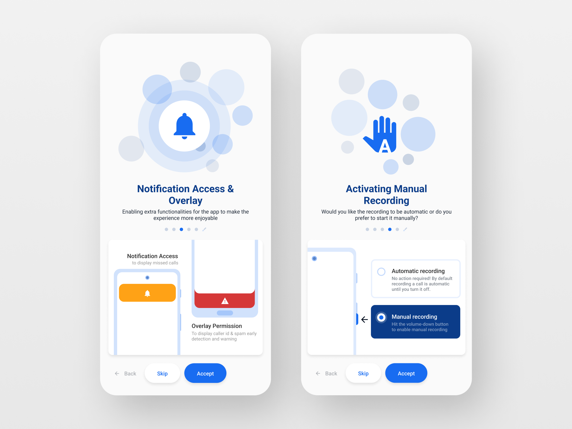
Something to highlight is that the circles surrounding the icons throughout the app are always positioned at a consistent distance from any nearby objects. However, for the Notifications and Overlay access screen, this rule has been broken, and the circles have been modified to convey both concepts (notify + overlay). The circles now depict sound waves emanating from the icon to represent notifications, and for overlay access, new circles overlap with the existing elements and produce a hover-over effect.

Progress
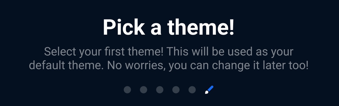
As an additional feature, the onboarding progress can be tracked below the title and subtitle area. Each circle represents a step in the process, and the paintbrush (which symbolizes the app, as it is a theming app) represents the end goal, signifying progress towards app usage.

Accepting terms and conditions
The initial screen in the onboarding process prompts the user to accept the app's Privacy Policy and Terms and Conditions. This step is positioned at the beginning of the process because it is crucial for the user to agree to these terms before proceeding. Placing it at the end would cause the user to complete unnecessary tasks and only learn later on that the app cannot be used if the terms are not accepted, leading to frustration.
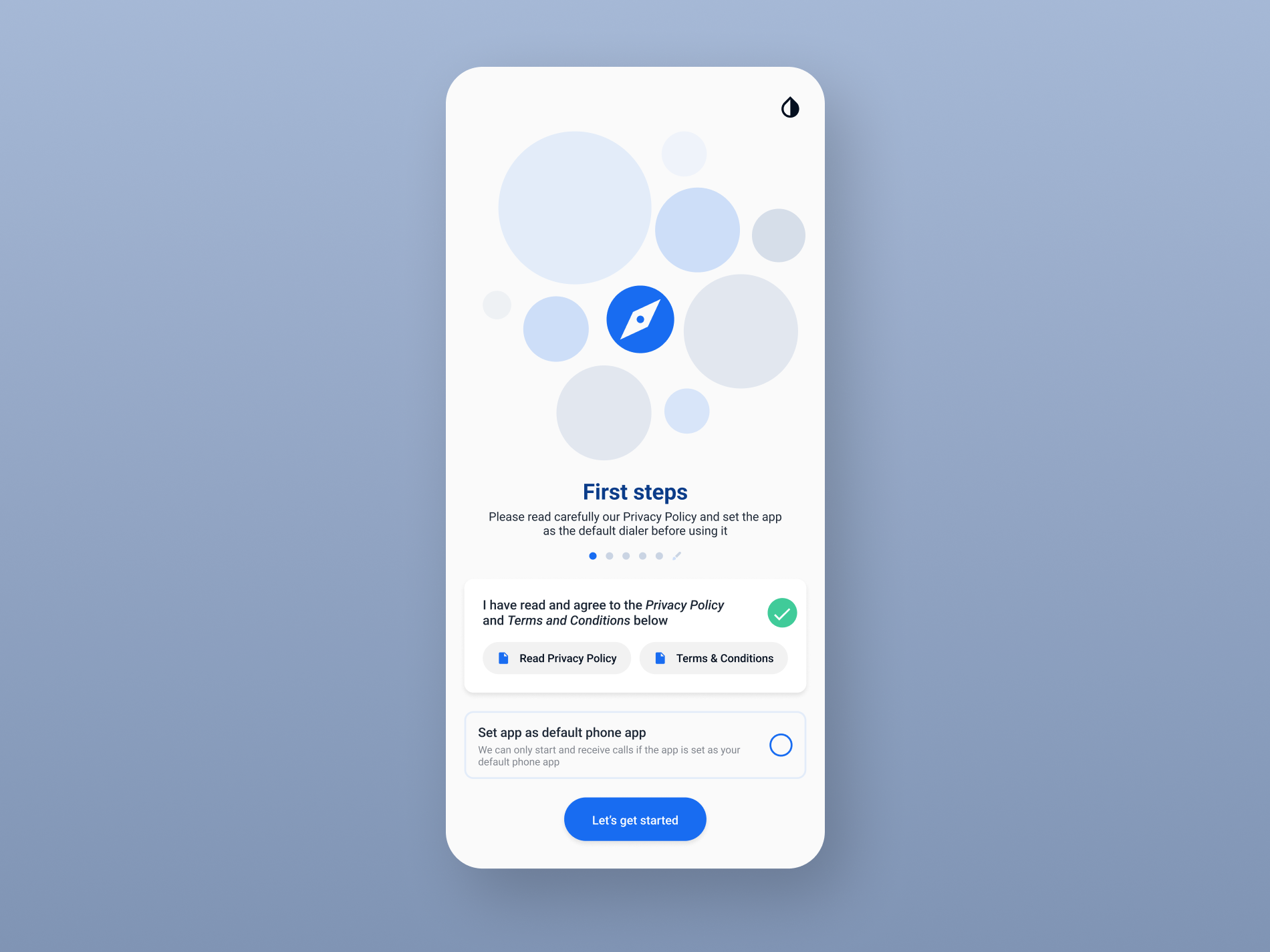
In addition, the app allows the user to switch the theme from the top right corner as soon as it opens. The default theme of the app is designed to adjust to the system's theme (which is not visible here) to prevent theme mismatches and issues such as a bright screen in a dark environment.
Accepting permissions
As with many apps, certain permissions must be accepted before use. These permissions are presented as a clear list on the left side of the subsequent image. This screen serves solely to inform the user of what will be requested in the following screens, but making clear beforehand which will be the intentions of the process.
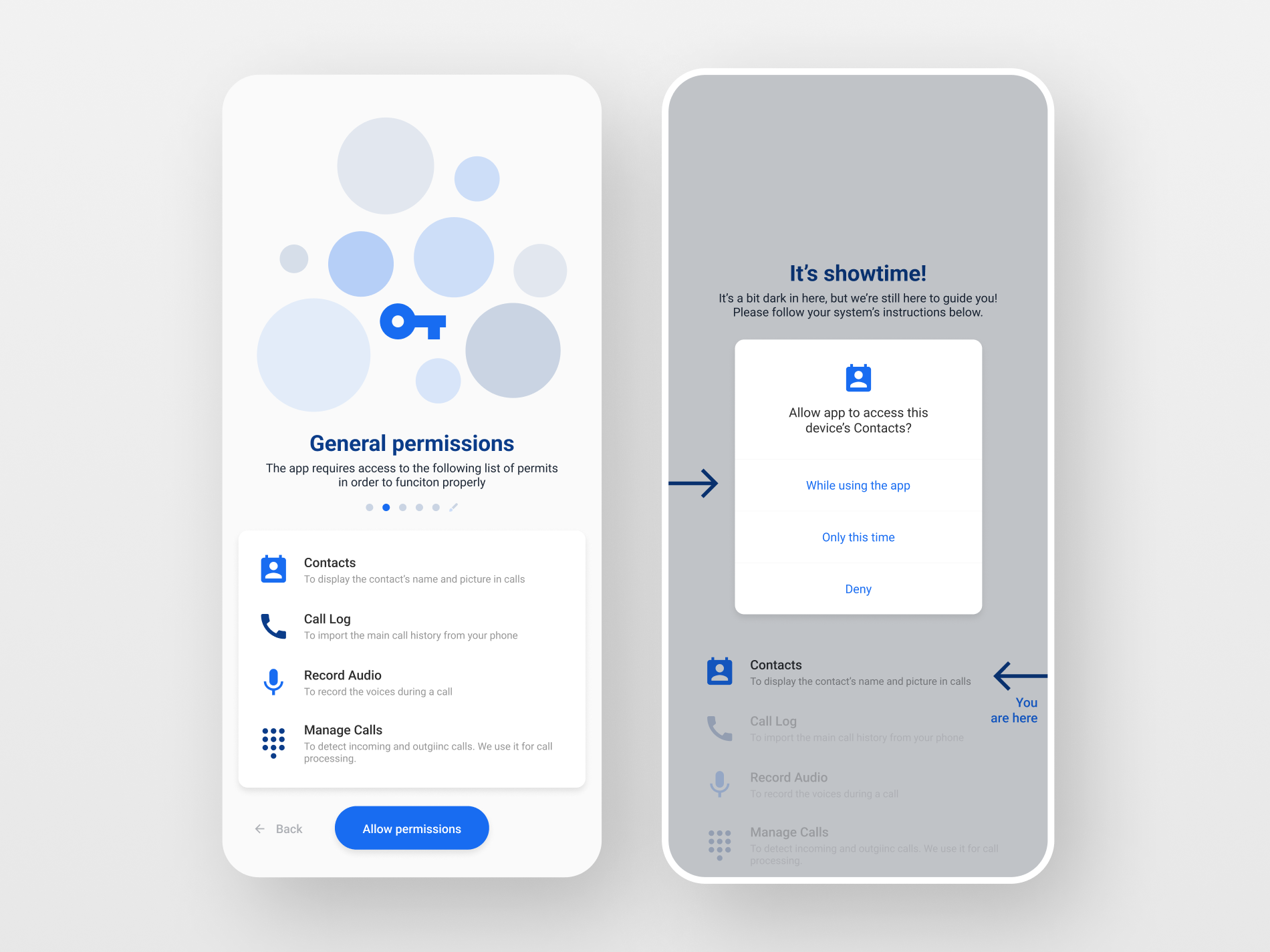
The right screen displays the system's pop-up window, which officially allows the necessary permits. A new support feature has been added with three key aspects:
- An indicator is displayed by the title above the pop-up window in the shaded area, informing the user that this new feature offers constant support.
- An arrow is included on the left side of the screen, pointing to the most suggested option to select in the pop-up window.
- The list of permits presented earlier (on the left screen) is also displayed underneath the pop-up window in a different format, serving as a reminder of what is being done and indicating progress with another arrow and small text.
After all the permits have been accepted, the app goes on with no further interaction.
Allowing additional access
The next permits also trigger the system's native pop-up windows to accept access, but our emphasis is on other aspects, so we will not be describing them.
Instead, we will be describing the visuals that indicate what will happen after enabling these extra permits.
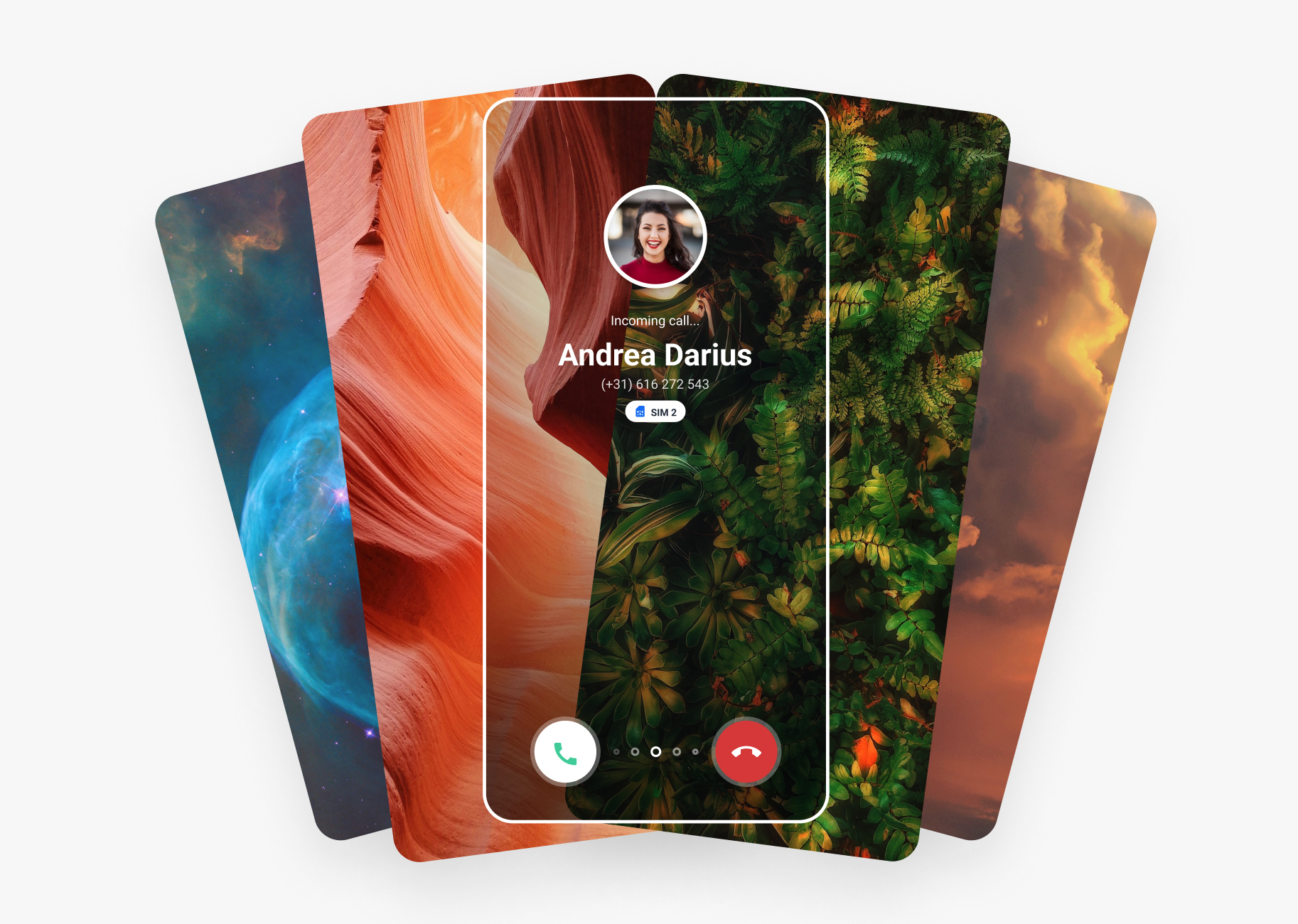
Notifications
Once the User allows notifications and overlay access, they will be able to receive notifications, which typically appear to "fall" from the top of the screen. Additionally, alerts will be displayed at the bottom of the screen to differentiate them from notifications.
These interactions are displayed in the lower part of the screen to familiarize the user with that particular view (see image right below).

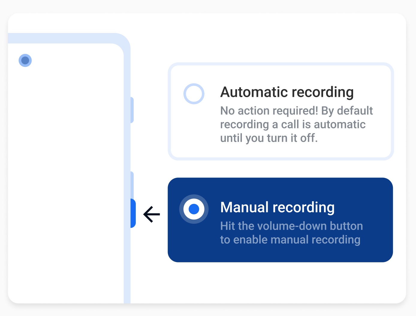
Manual recording
Another feature the app contains is call recording. This feature needs also some extra permits and accesses, but we'll be focusing on how do we let the User know what to do after they've enabled them, how do they operate those features the permits enabled.
Same as in the previous section, a small illustration displays the two modes the app operates in:
- Automatic mode: Which doesn't require any User action, as the app records the call automatically. In the illustration, the box representing Automatic mode is positioned on top of the Manual mode box, giving the impression that it's "floating around" and won't require touching anything to activate.
- Manual mode: Which requires the User to click the volume-down button on the phone. The Manual mode box is located next to the volume buttons on the phone mockup, providing a clear indication of what the User needs to do.
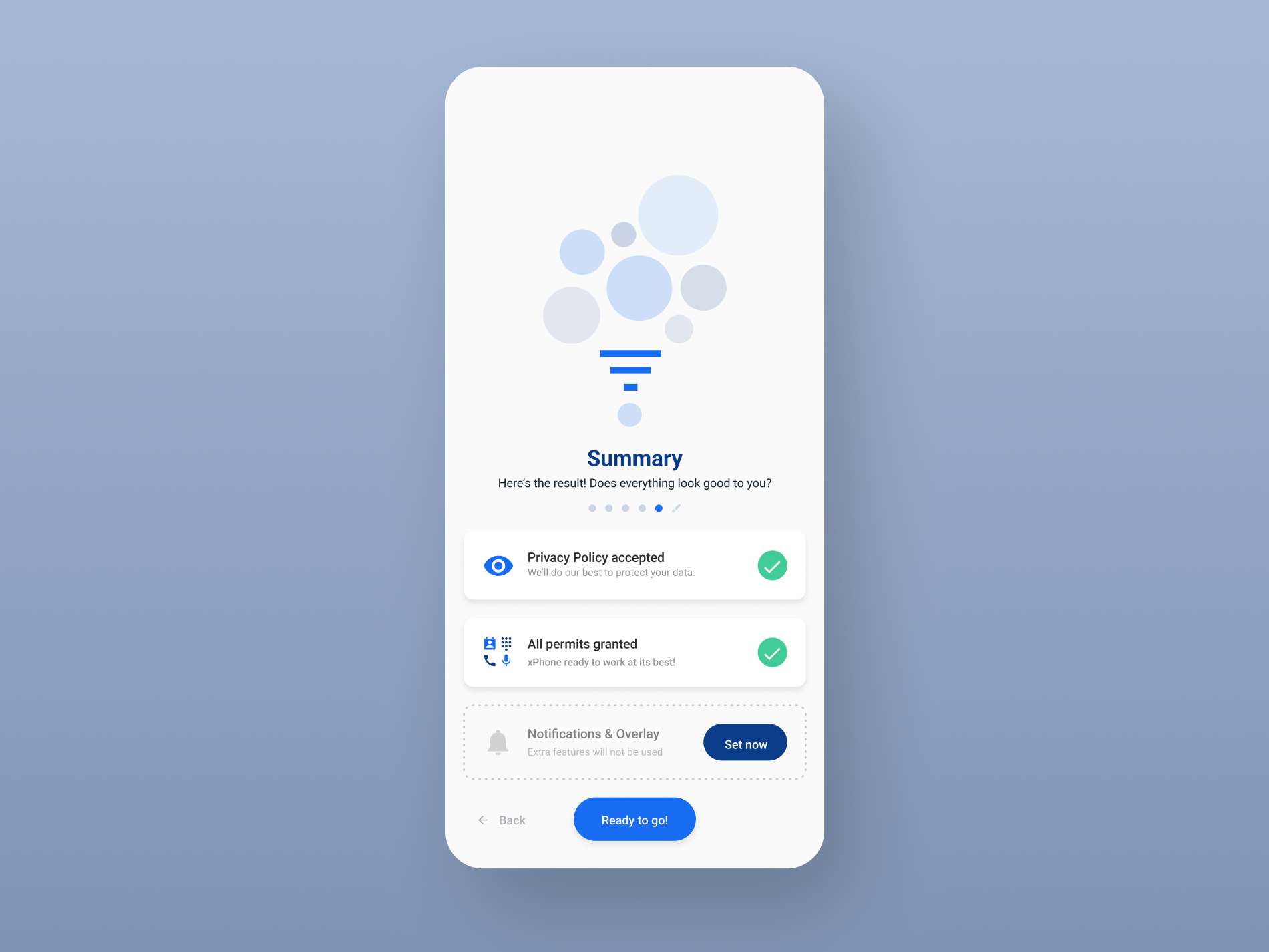
Summary
The final screen of the onboarding process is the summary screen which displays a summary of all the permissions that have been accepted throughout the process. The only optional part of the onboarding process is the "Notifications & Overlay" section, which can be skipped. The summary screen indicates this and provides the option to return to that section to enable these permissions.
The progress bar located underneath the title signifies that we are one step away from using the app. By clicking on the "Ready to go!" button, the onboarding process is completed.
Phase 2 - Main app
This designs are the continuation of Call Themer's onboarding process, representing the second phase of a project for the same client, but at a later time.
The app's concept revolves around having a unique theme for each contact on the contact list. Users can customize these themes to a great extent, including selecting backgrounds and dial styles.
1. Landing page
The main screen serves as a brief introduction to the app's capabilities, providing users with a quick understanding of its functionality. As the app allows for the customization of call screens, there is no default theme when the user initially launches the app. This is intentional, as it reinforces the app's emphasis on personalization and customization from the very first steps.

The app's main screen features a circular progress indicator that now displays a brush icon, signifying that the app is ready for use. This seamless transition from the onboarding process creates a connection between the two, smoothly transitioning from one to the other.
The circular design theme established during the onboarding is also carried over to this screen. The use of contrasting colors is noticeable as the theme is now black (assuming the User has chosen that option).

2. Gallery
The screen's main page is the gallery, where the user can browse available themes and access the management screen.
The gallery consists of a collection of galleries, each with a different theme. The user's created themes are displayed at the top for easy access, followed by the other categories in descending priority. This design is based on the idea that the user's frequently used and created themes should be highly accessible.

3. Themes slideshow
The Themes section of the application provides extensive customization options for users.
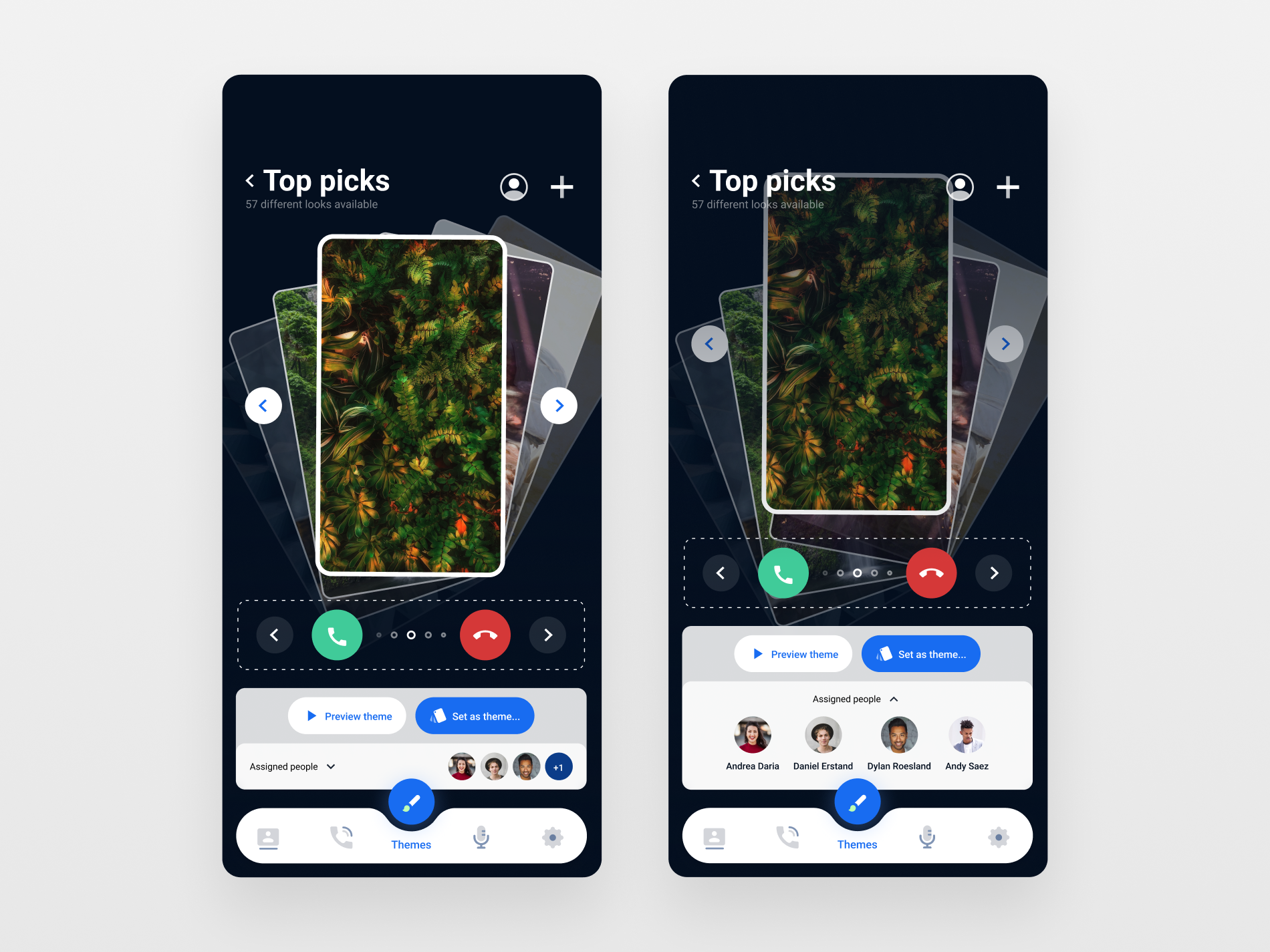
To enhance the personalization capabilities of the application, the screens and answer/decline buttons are separated into distinct menus, allowing for more flexibility in mixing and matching. The main feature of the application, the slideshow, is given priority and occupies significant screen real estate, while other elements are carefully resized.
It's worth noting that the stroke of each individual wallpaper has been set to white to create contrast within the stack elements. The selected wallpaper, which is displayed prominently in the center, features a thicker stroke to indicate its current state. This design choice helps users quickly identify which wallpaper is currently selected and improves the overall visual hierarchy of the interface.
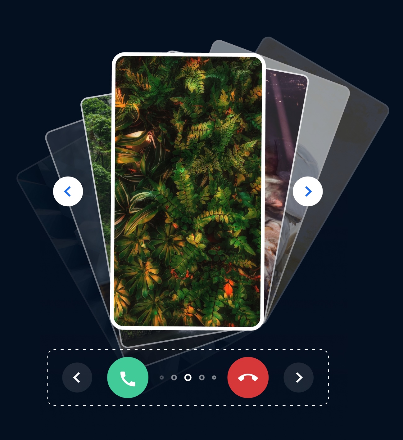
To enhance the slideshow-like experience, the app displays the main wallpaper selected by the user with a stack of other wallpaper items behind it. This design provides a visual cue for the range of items available for users to swipe through in both directions. Additionally, it fills up the central space and prevents a vacant area.
The menu below the slideshow provides fundamental tools for setting and previewing themes. Users can preview how a theme will look in real life and assign it to their device.
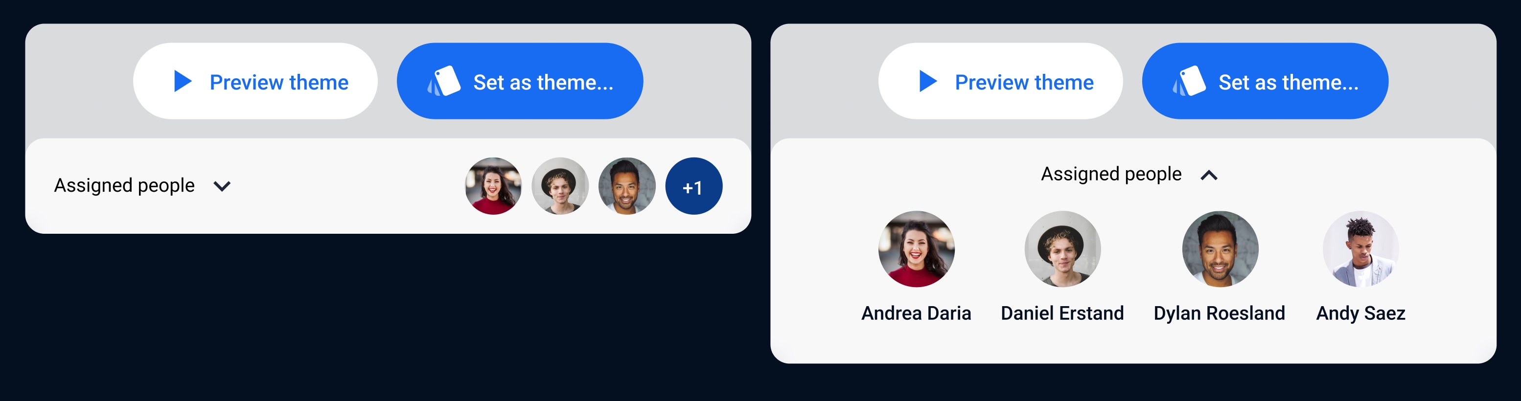
An additional feature allows users to see which individuals have the theme assigned, with the option to expand and view their names. Initially, the section's size is collapsed to minimize space usage, but users can interact with it to open it in a separate menu.
Once you have chosen a theme, you can proceed to the next step by clicking the "Set as theme..." button. The ellipsis in the button label indicates that a new modal will appear before the theme change takes effect.
3. Assigning theme
After clicking the "Set as theme..." button, we arrive at a modal view where we can choose a theme.
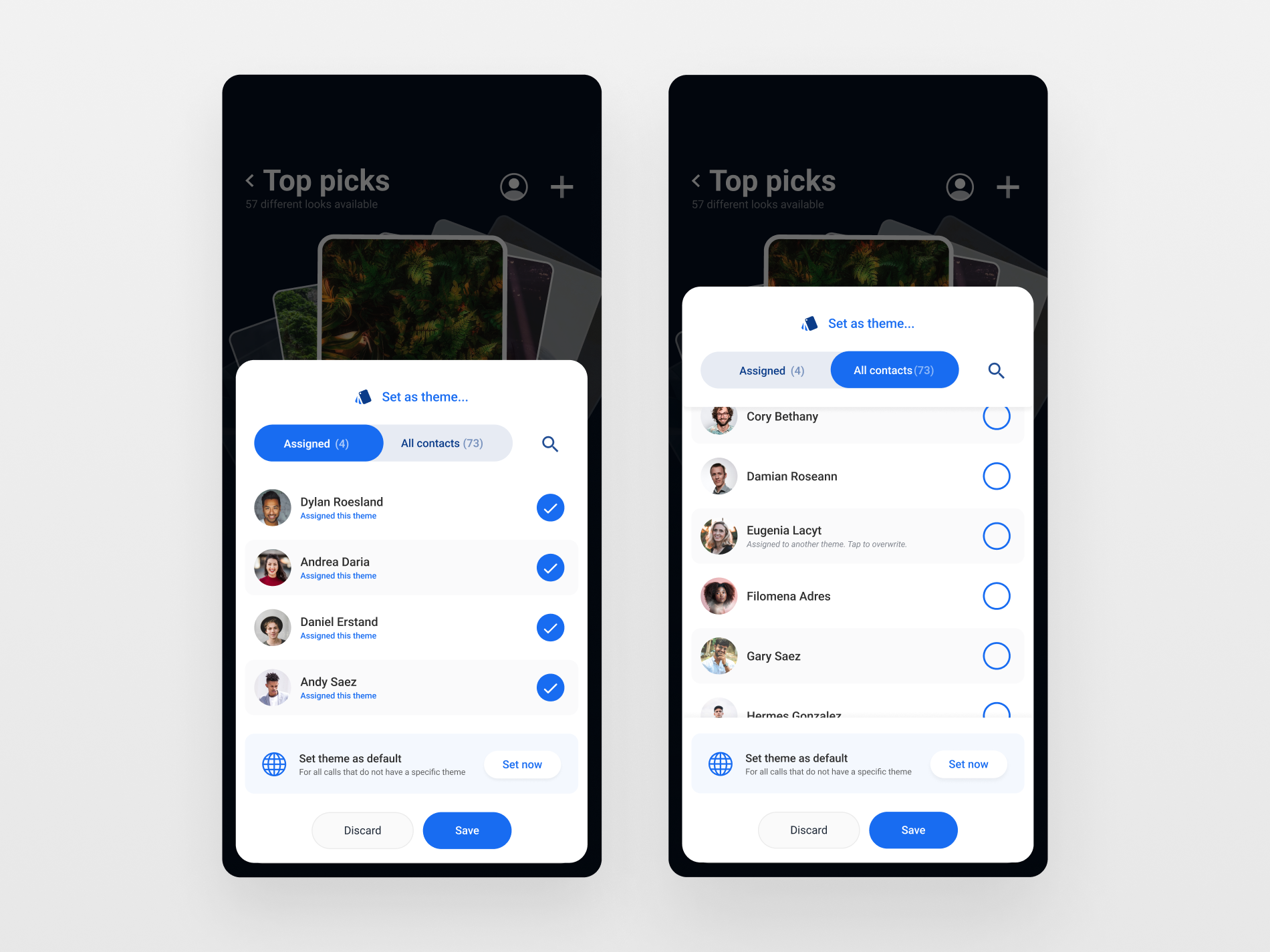
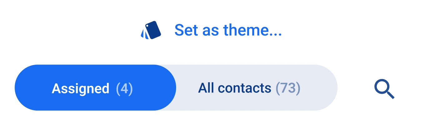
At the top of the view, there is a toggle menu that displays the contacts that have already been assigned a theme, as well as the full list of contacts. The list is positioned at the top, as is typical for lists that allow switching between categories. Additionally, the search button, which allows us to search for contacts by name, is also located in the same position. This placement is intended to align with the user's expectation that these items are commonly positioned at the top of a list.
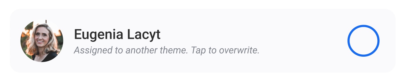
When browsing the "All contacts" lists, all contacts stored in the phone are visible. If a contact has an assigned theme, this information is displayed beneath their name, along with instructions on how to overwrite the assigned theme. This feature helps users quickly identify which contacts already have a theme assigned and provides clear guidance on how to change it if desired.
When a theme is overwritten, the message changes to reflect the new state, and provides an option to undo the change. This feature is designed to ensure that users have complete control over their selected themes, and can easily revert back to the previous state if they change their mind.

4. Creating new theme
Creating a custom theme is one of the key features of the app, and it can be achieved by uploading a desired image. Since this feature is essential to the user experience, it has been designed building upon the earlier details outlined in the app's interface.
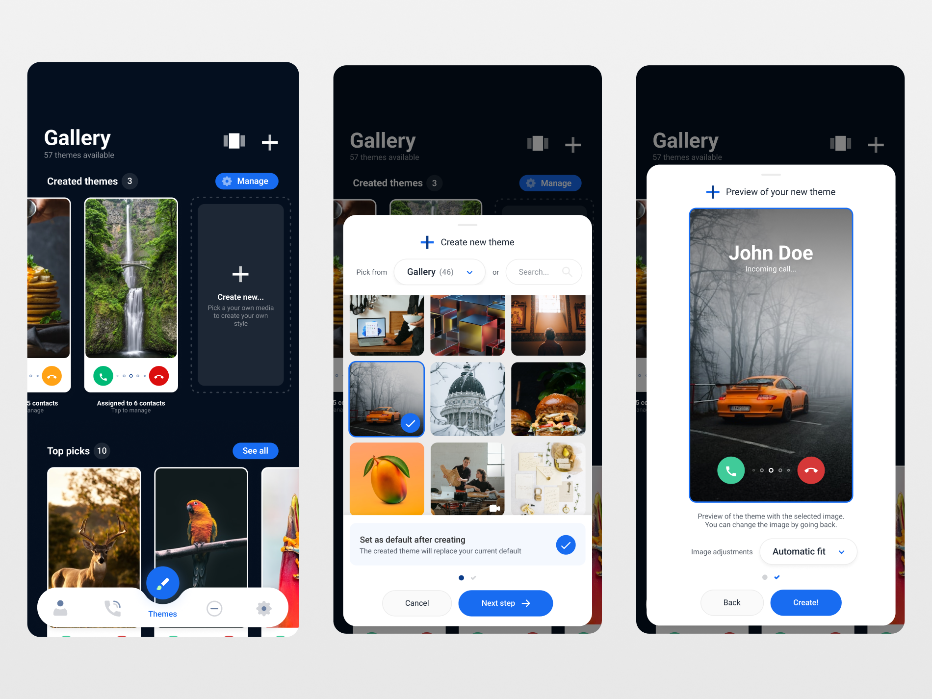
As seen on the first screen of the sequence, adding a new theme can be accessed from two locations:
- First, from the "+" icon that's available in the top bar of the app at all times. This provides easy access to the adding feature, eliminating the need for unnecessary navigations to the home page.
- Second, when the User reaches the end of the "Created themes" list in the main gallery, they have the option to create their own theme. This logic is based on the idea that the User may scroll through themes with the intention of finding one they like. If they are unable to find a suitable theme, they can create one themselves.
When the User selects any location, a modal sheet appears, initiating the creation process. Within this modal sheet, the User can choose an image from their phone by selecting from various sources such as the Gallery or Downloads folder. Additionally, it is possible to search the web for images, although the interaction for this is not shown here. These options are located at the top of the popup modal, as Users expect to find them there due to the common layout of galleries and apps that import images. This also prevents further cluttering of the bottom, which is reserved for modal navigation.
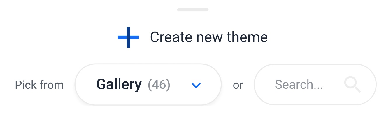
At the top of the sheet, a horizontal light gray bar is displayed to indicate that swiping down will close the modal. This is a familiar UI element that Users are accustomed to seeing, and it provides a clear and intuitive way to close the modal.
Below the sources navigation, the primary element is a grid of images organized in columns of three items. By maintaining a 1:1 aspect ratio for the images and organizing them in this way, the images are large enough to display their content, while also remaining small enough to avoid filling too much space and causing excessive scrolling.
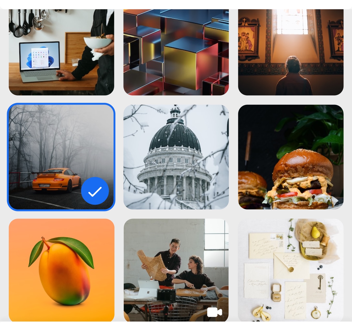
As the themes also support the selection of videos, these are identified by a small white video icon. To ensure that this icon remains visible on bright backgrounds, it is always presented with a black gradient background.
Finally, the bottom navigation provides traditional controls for canceling the operation or proceeding forward. The progress is displayed directly above these controls, giving the impression that this is a simple and quick process that only involves 2 steps: The selection one (current) and the validation one (represented by a check).

When the User proceeds to the next step, a preview of the selected image is displayed. It is crucial to show the User how the final result will appear, as the primary objective of the app is to create a theme that meets their preferences. To achieve this, the preview includes dial buttons for declining or answering calls, as well as a mock name displayed atop the selected image. Together, these elements comprise the final result.
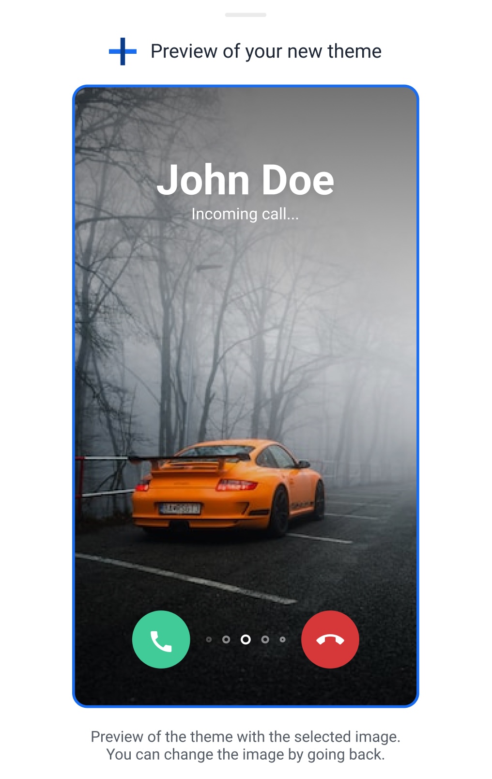
Additionally, there are explicit instructions displayed beneath the preview, indicating the current step in the process and how to change the selected image if the User changes their mind. These instructions provide clarity and guidance throughout the creation process.
The final result
Here you'll find our app's finished designs. We're excited to share the final result with you and hope you'll love using our app.


