

Completion time
Am I the right person for you? Let's see:
... and what cannot
Not good at everything, what can I say!
The background story
Call Master is the result of a long journey during which many call-related apps have been designed. The first app was only dedicated to record calls. Then, it evolved to a version in which you could also block incoming calls (or contacts). After that, recording and storage management came into play. And eventually, it all merged into the same app!
How did we do it
This whole project has been developed for a private client throughout one year and a half of intermittent communication, as the app has been developed in phases.
The project needs were shared via email, sometimes accompanied by screenshots of the current version of the app that needed to be improved or rethought and, other with desirable features the competitors had.
The value I brought to the project
Throughout the development of this project, my primary responsibility was to oversee the app's user interface and user experience design. Specifically, I took care of the entire UI/UX design of the app's main features, ensuring that they were intuitive, easy to use, and aesthetically pleasing.
I took on the responsibility of:
- Designing wireframes for the whole app.
- Full-scale overhaul of the app's UI/UX, involving a deep analysis of the existing design and identifying areas of improvement.
- Integrating the desired new feature of call recording into the call app.
- Ensuring that every UI element in the app was stylish and accessible to all users.
- Providing quality hand-off to the developers team ensuring that they were equipped with all the necessary information to create the app effectively.
I am proud of my involvement in this project as a UI/UX designer. My contribution has resulted in an aesthetically pleasing and user-friendly app that delivers a seamless experience to its users.
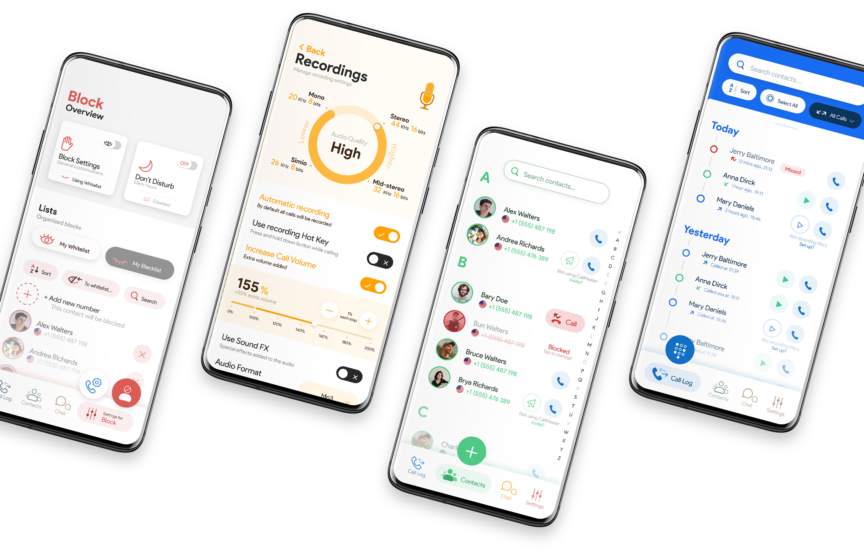
The design process
General
- Each space's primary color intends to create a visual environment that aids the User to feel which space is in since this app’s functionality puts together 3 separate OS apps (Phone, Contacts, Messages). The colouring works together with the bottom navigation: Each menu is coloured in the same hue as the space primary color.
- For each space, a specific main action is accessible through a FAB button. Its main functionality adapts to the current action in the visible screen, enabling immediate access to the (expected) most common action. E.g. When we are in the Contacts screen (green) we can add a new contact through the FAB button, but when we select (by tapping) a Contact to preview their information, it turns into a “Close” button to exit the focus mode.
- In the same like as colouring, the FAB button “follows” the bottom menu bar selection, strengthening the feeling of being in a specific space.
Phone call log
The call log screen contains all the calls made through the app arranged in a timeline that displays each day of the week, usually displaying the date. The tags "today" and "yesterday" are meant to ease the grasp of the date, that is, not having to remember which date is it today (happens more often that we'd like it to).
The FAB button for this page is no surprise: It allows opening the dial to make a new call.
The next screen includes most of the items we can see in a call log, but I'd like to emphasize one tiny one: The search bar at the top. Please notice the small bar at the very top-end of the log. It indicates the whole timeline is draggable and, by doing so, the search will appear. Would you be able to
.jpg)
The call log is displayed in a vertical continuous scroll, just like any other call app. It allows tapping on an individual call to open its details, and show all the features that link to other spaces. Right next to the call button, the play button indicates there’s a recording available. Its color is green since the recording is associated with Contacts. Both the call and the play buttons allow quick action.
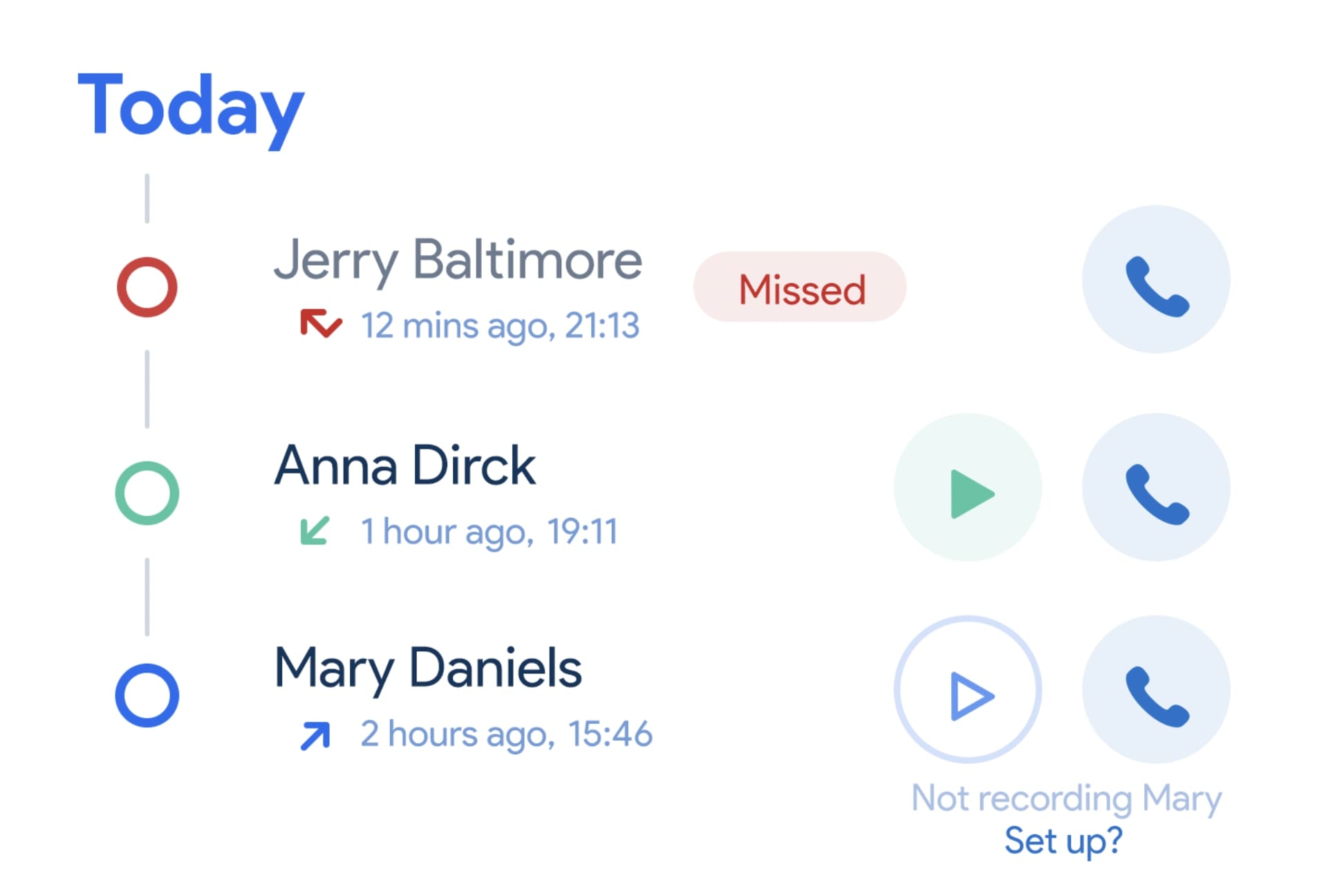
In the vertical day-grouping, each arrow icon symbolises the kind of call (Received/Made/Missed) with known icons. Their colours match the “attached” circles’ (to the call sequence) colour, which intend to stick out the kind of call:
- Received -> Green (successful)
- Made -> Blue (made by Phone space of the app)
- Missed -> Red (unsuccessful).
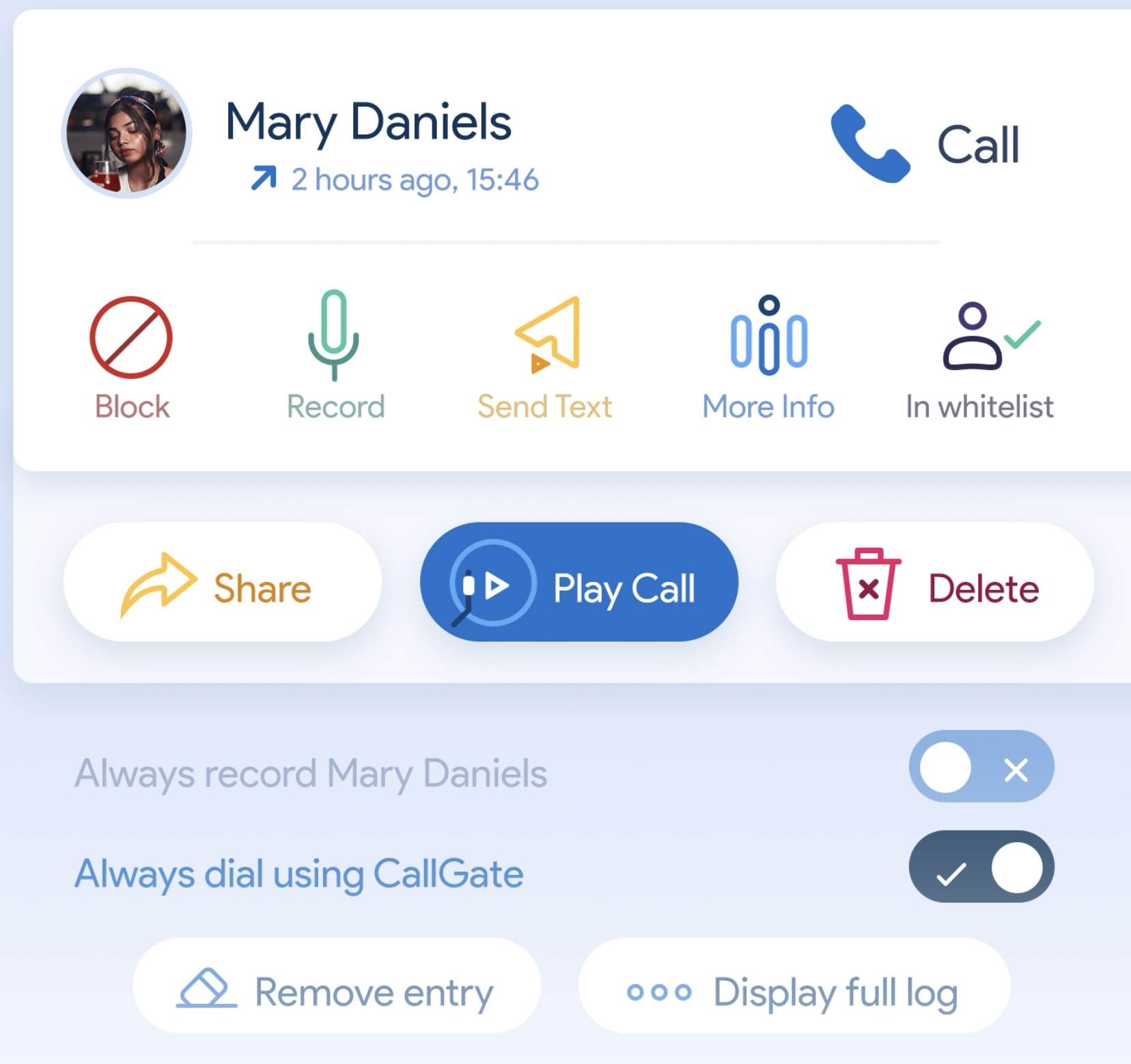
When tapping on a contact we can have access to all the tools and actions related to a call and the user. The color scheme here also follows the general rules of the app:
- Blue is related to the Call log, hence calling, displaying more information about the call and playing a call's recording use blue. Since we're sill in the call log, all the preferences related to the log (removing an entry, displaying the full log, etc.) are blue-hued.
- Green is related to Contacts. As the recording capabilities are stored individually per contact, its icon is green.
- Red is for blocking. It is also used for deleting a log entrance, as red is often used for this action.
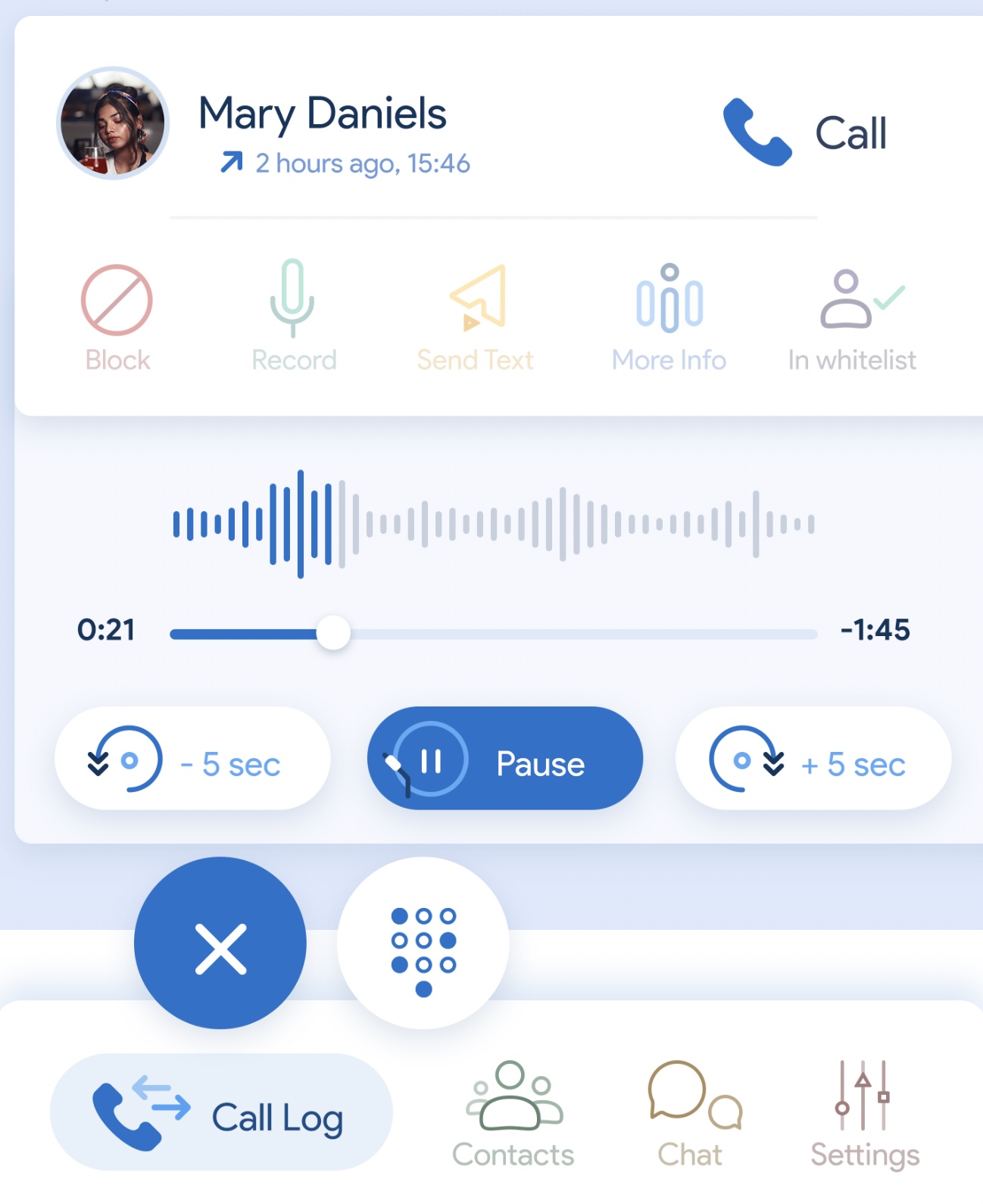
When playing a recording, pause and rewind actions become available. Besides, the FAB button transforms into a shortcut acquiring the following behaviour:
- The FAB duplicates itself, containing 2 actions: The main action will now close the whole log entry. It gets the log's main blue color as a way to emphasize its presence.
- Opening the dial is still available, but has been downgraded to a secondary role.
This decision was made in order to avoid having to scroll up and down the screen to close the log entry while keeping the actions within reach of the thumb.
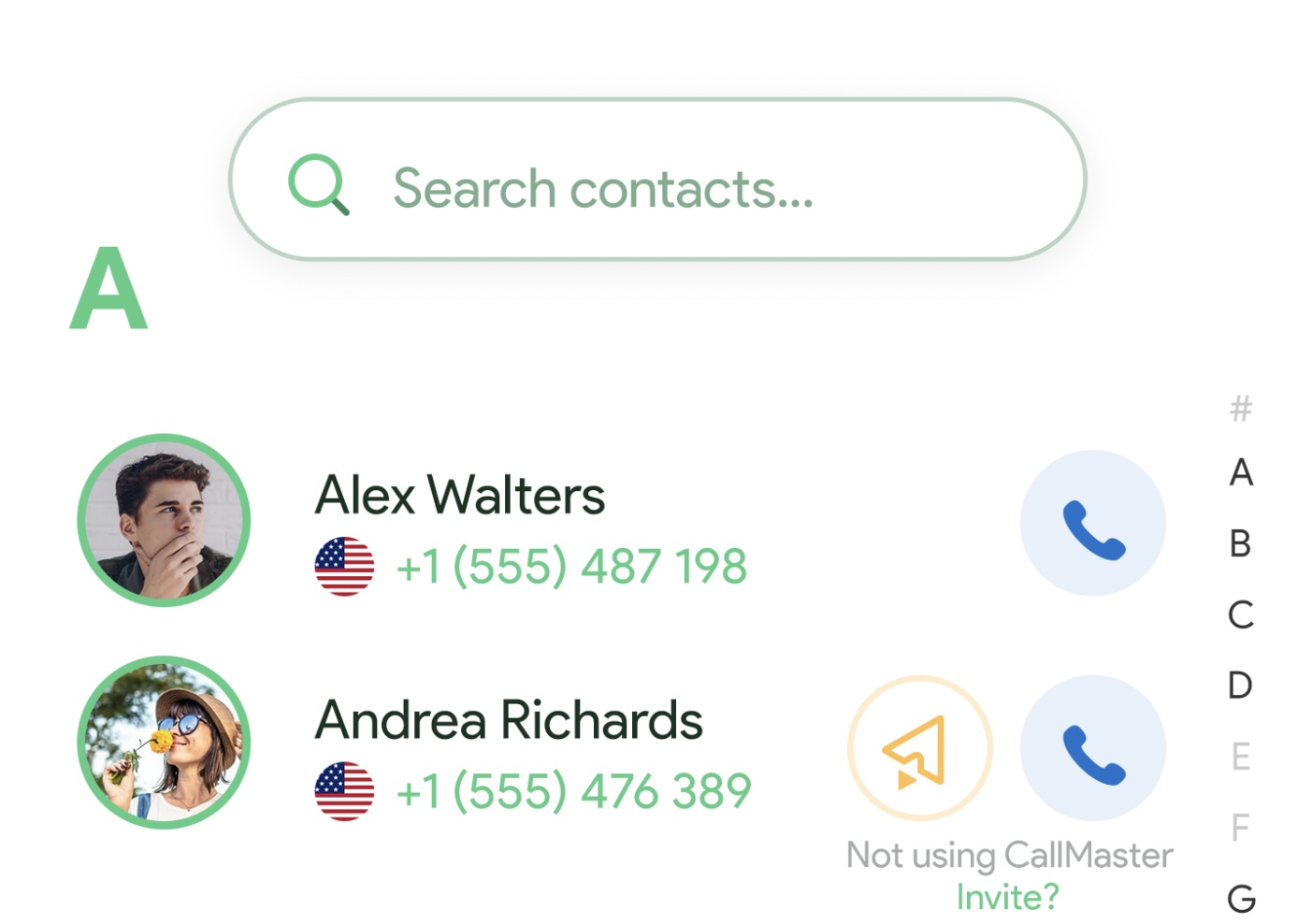
Contacts
Changing the scene to the call log's most common companion: The contacts. In order to indicate this change of scene the hues that represent the Contacts screen changes completely, while keeping its connections to the rest of the screens as we'll see in a bit.
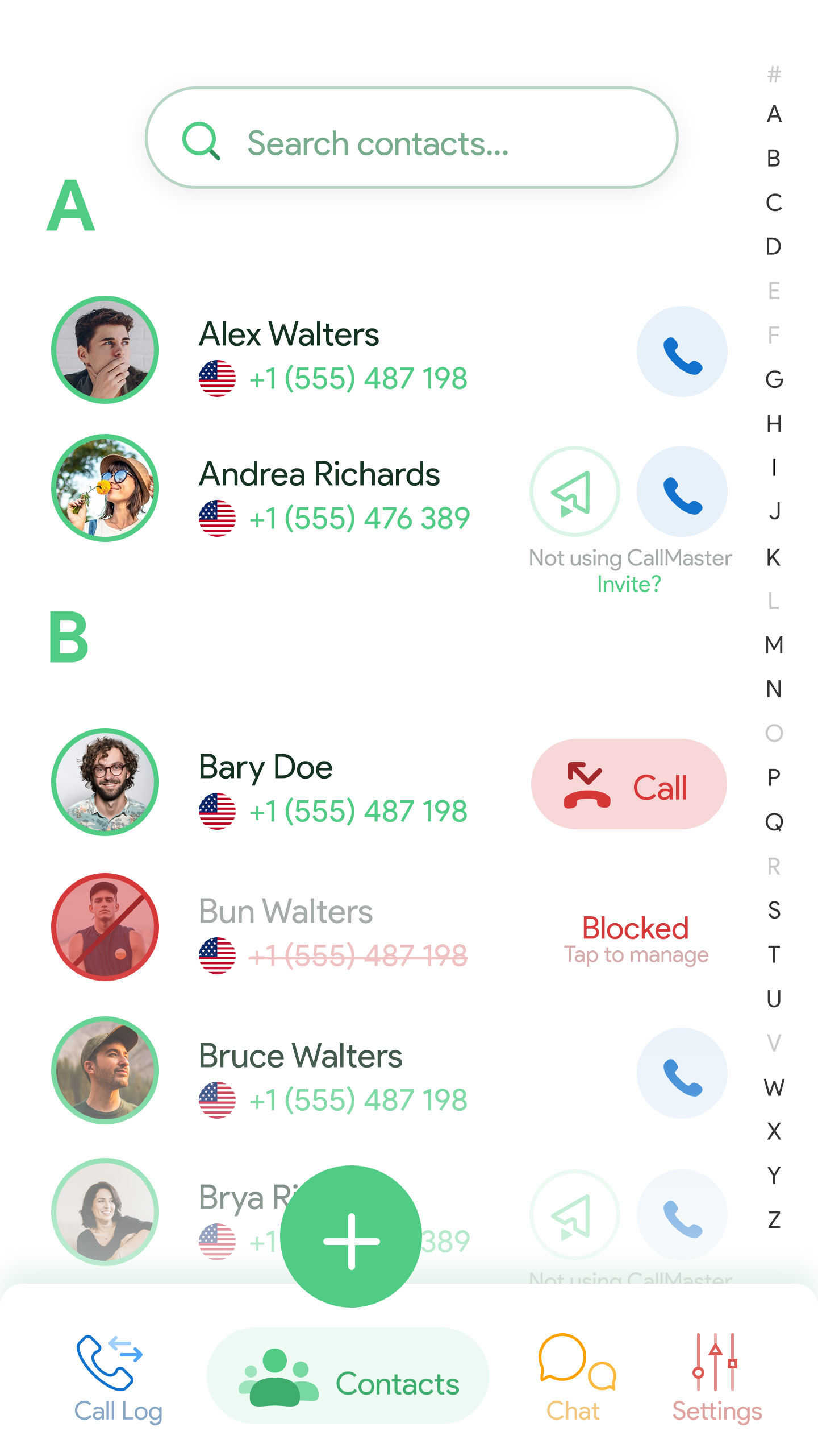
The blue-coloured phone icons next to each contact reference the Phone space, while the orange ones refer the Chat space, where you can send SMS messages to invite people to the app. Besides, as an extra feature, the flag of the contact's main number country is displayed next to the phone number to prevent the user from having to guess. This is important to also prevent extra calling costs in some countries.
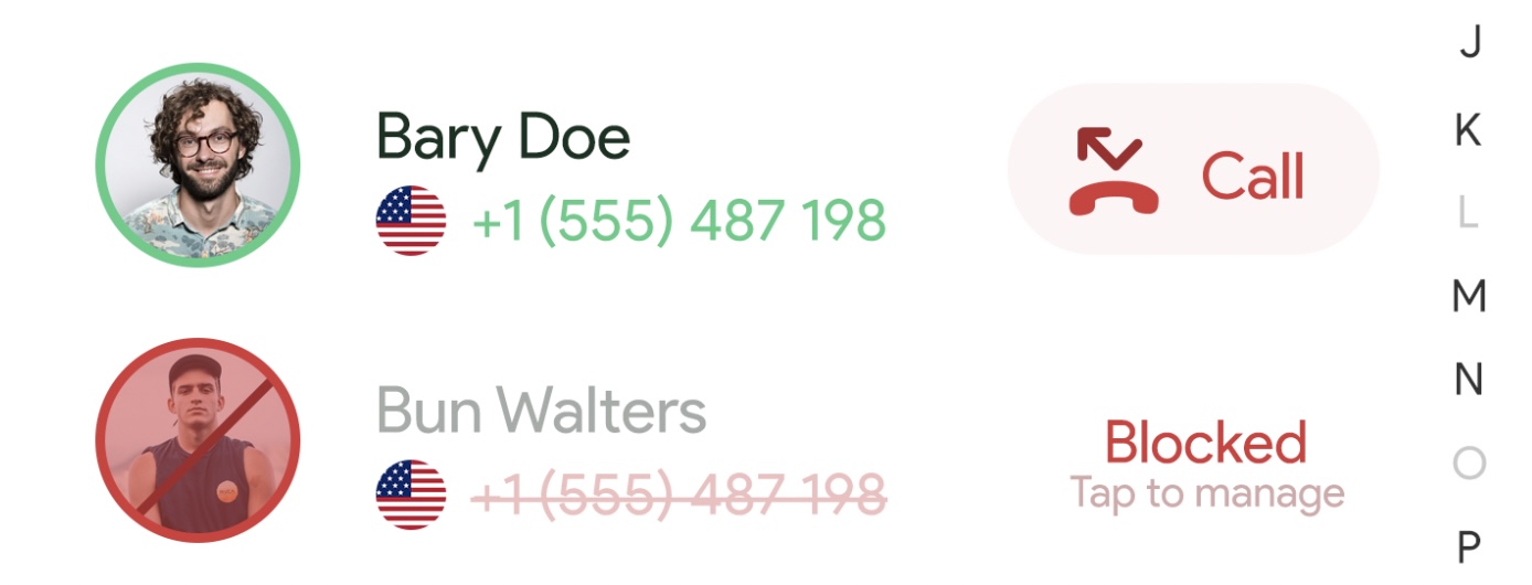
In order to follow the color logic found in Figures 1 and 2, the missed calls and the blocked contacts appear in red. When missing a call, the shortcut action displayed next to the Contact allows making a call directly from the Contacts list. Since blocking someone needs more settings setup, tapping on a blocked contact will redirect you to the Block section.
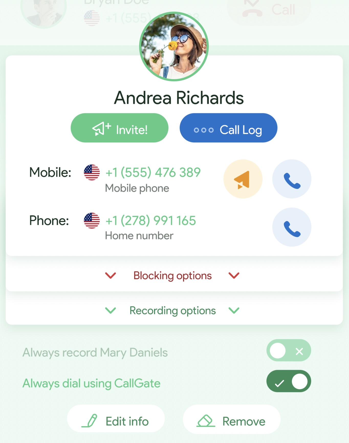
When tapping on a contact, a card similar to the log entries appear, displaying a preview. As usual, log-related actions are colored in blue, while messaging is yellow, blocking red and, the rest of the info green.
Block
The block settings have specific settings for blocked and not-blocked contacts. The specific settings are kept at the top of the screen, in two widgets (that allow some quick actions too), while the lists of blocked and not-blocked people are managed below, in the blacklist and the whitelist areas, respectively. Just as in the Contacts screen, the change of scene is made by using a different hue, this time red.
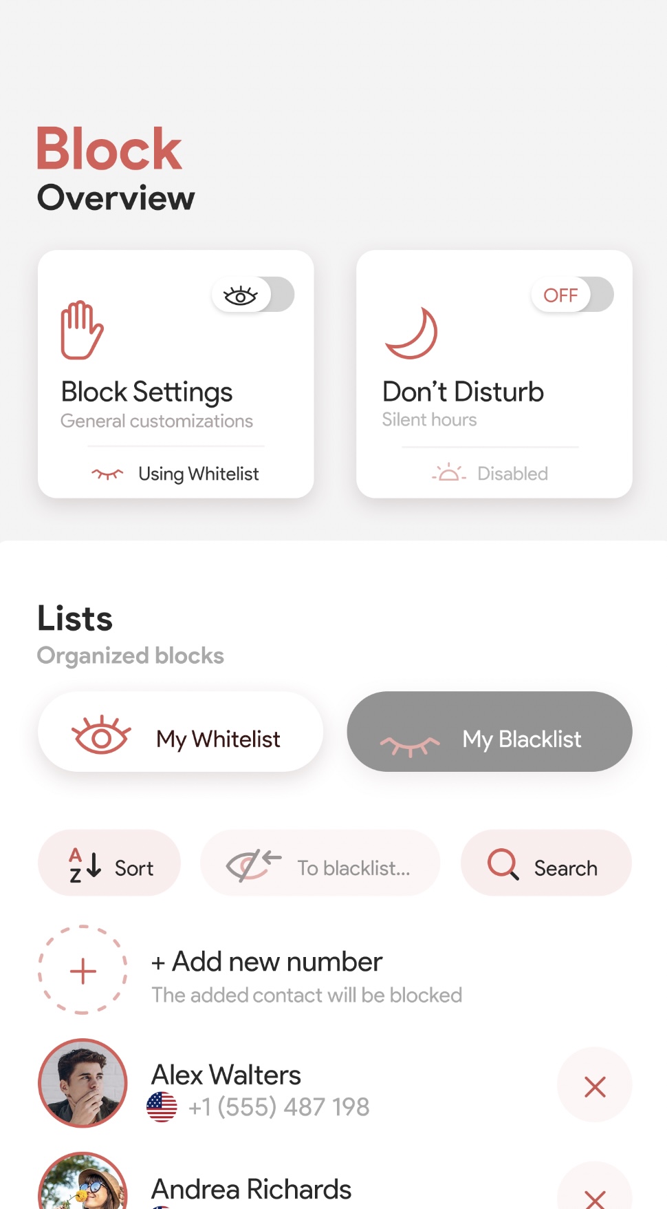
The top section of the screen acts as a shortcut to the main features of the block screen. As each of the widgets redirects to another screen where they can enable or disable preferences, a toggle shortcut has been placed at the top-right corner of each widget. Besides, each of the screens that can be accessed through them contain extra elements, such as, from left to right, choosing the default block list and setting a Do not disturb time period, respectively. This vital information is also reflected on the widget to avoid unnecessary back and forth taps.
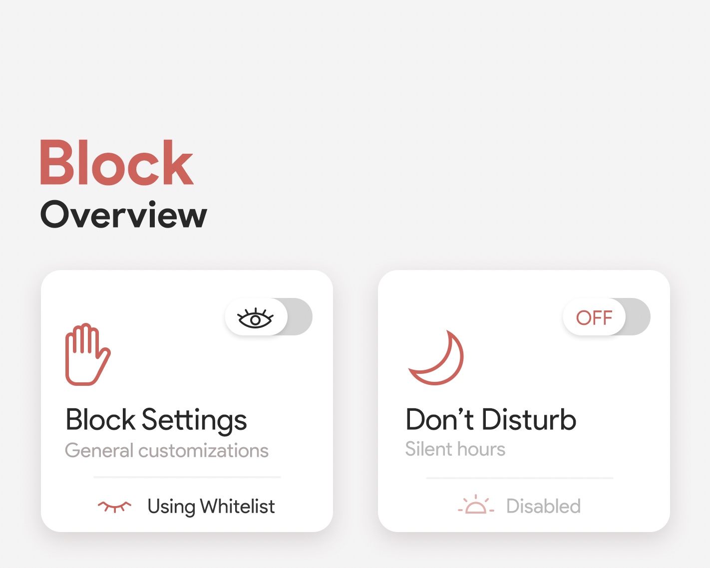
Next we encounter the organization blocks that differentiate the blocked users from the regular users. The logic behind it it's not more complex than a simple list, with the exception of them being exclusive, that being that a user can only be present in one list at the time. The list can be sorted, and its elements searched for, both basic features of a list.
Blocking a user from making calls means they have been added to your blacklist which has a dark background as a trick to both match the semantics of the black-list and to attract one's attention.

But why keeping a double exclusive list? Wouldn't it be enough to have one single "blocked" list instead? It would do the same trick, wouldn't it? Well, yeah, it would! But keeping two lists is all about being explicit. By showing the User someone is in their whitelist reassures there's nothing wrong with receiving/making calls, as far as it concerns the app. Not only that, but prevents us from needing a second screen or modal that would pop-up when we'd need to block somebody.
Recording
Last but not least, the remaining screen of the app's settings, featuring the last hue of the collection (yellow): The settings.
Following the same style as the Block screen, the main widgets remain at the top of the screen, containing (when necessary) extra information about vital features as, for example, the remaining free memory allocated to the app.
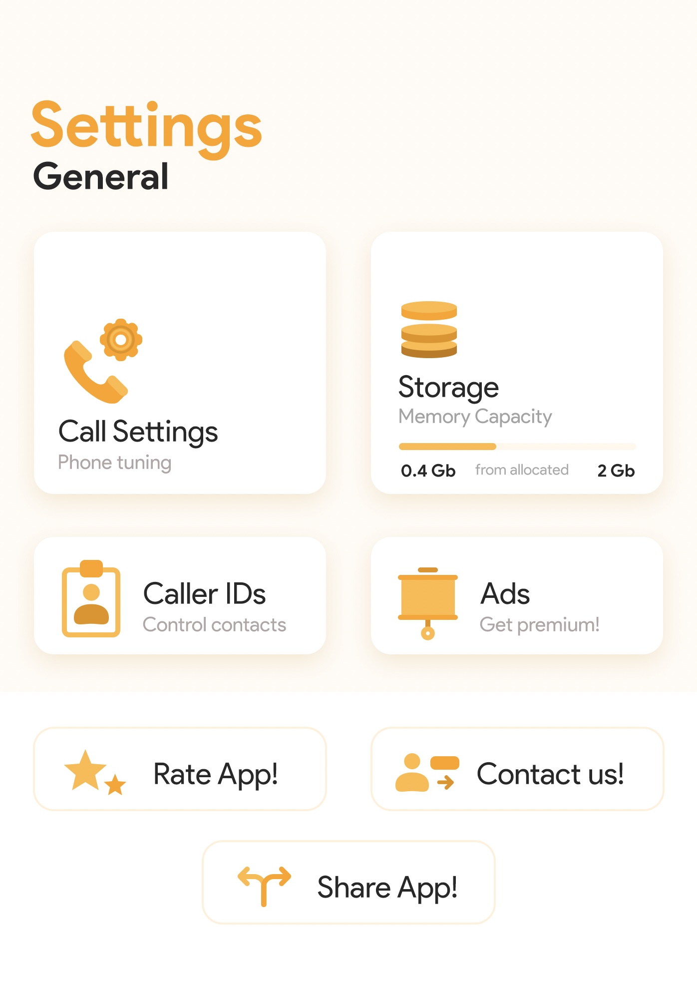
In order to differentiate between app core features and elements that belong to the app's publicity, the style of the containing boxes changes slightly. The promotional elements intend to be a bit more discreet while remaining relevant, which is why they keep their color icons but they've been pushed down the screen and they merely use a thin colored stroke to indicate their boundaries.
Amongst the settings we encounter the recording preferences we see below.
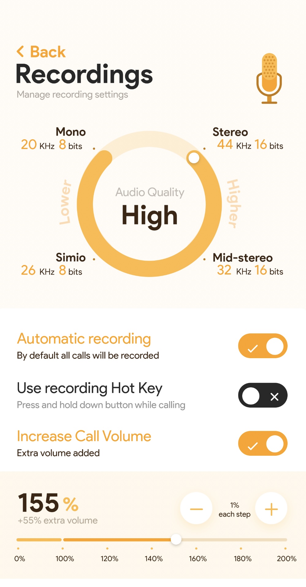
To start with, we have a reimagined slider. The project's specs asked for a way to select the quality of the recorded calls. As recording a call is a main feature in the app, I considered selecting its quality should occupy the main stage in its own settings menu.
Since a regular horizontal slider has limited horizontal space to include information, I thought of a rounded option. A circle, although taking much more vertical space, leaves its corners a bit empty, which is perfect for placing the options and their details. Please mind there are 3 pieces of information to include in the details of each option: Name, two numbers and two units. Altogether, they take quite some space but, when grouped correctly around the 4 of the most spacious "corners" left by the circle, the fall in the right place. This grouping is actually hierarchical, displaying the most common name of the option, then (smaller) its numeric information and last (even smaller), the number's units.
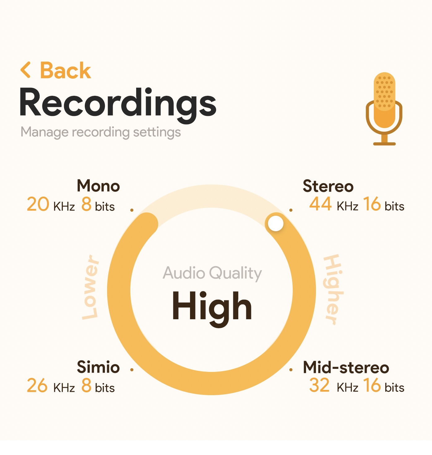
Returning to the vertical space issue, as the circle slider was intended to be the main element of the screen, taking up more space would accomplish that aim.
But now... A circular slider has theoretically no end, right? One can just spin and spin the slider grabber endlessly. To avoid that issue, the slider allows only 4 positions, one per choice positioned at its corners. Surpassing the maximum level ("Stereo") would not be allowed as the spin grabber will remain in place. It can only "jump" back to "Mono" by sliding back or tapping directly on the "Mono" option. As we'd do with any straight-line slider, the options are sorted by ascending order of KHz.
Finally, as an extra help feature, for those who do not know which quality level is better (that is lower or higher), labels indicating it have been placed around the slider. Despite being placed (almost) vertically, their readiness is not completely flawed, as they are still quite short words that we can quickly read. It would be much more difficult to read "Higher quality of sound", for example. Besides, they reduce the blank space that the slider options create.

After all the reasons I gave for having a circle-shaped slider: Here's a straight horizontal slider too! The reason for it are mostly the opposite of the main rounded one: (1) Need to keep it small, (2) Fewer details in the options, (3) not the main element of the screen.
This slider is meant to help increasing the maximum volume of the call, and it has a couple of particularities: First, the maximum volume allowed by the phone (100%) is shown in the slider too, but as a separate slider that cannot be interacted with. Because we're adding extra volume, our slider precedes this first one as if indicating "added on top of".
Then, as a slider can be quite imprecise if we want to set a specific value, we have the small-increase helper at the top-right corner of the slider, which helps us moving the value by its tiniest possible value of 1%.
About the rest of the settings underneath the slider, they're quite simple: They feature the title of the setting and a small description underneath, plus a modifier to their right. The reason why these settings do not have a fancy design is because the whole screen would have become quite crowded if they had. Hence, I picked the settings that are most prominent in the app and enhanced them in favour of the less likely-to-be-used ones.
Final note
If you got here and you're a bit confused about the navigation of this app, let me explain why it's not your fault: The navigation shown in the assembly contains mixed old and new designs, which means some feature a Call-Contacts-Chat-Settings while others contain a Call-Contacts-Block-Settings. How did this happen?
This is an old project which I had to rescue from an HDD I no longer use. and it appears I did not do a good job storing all the designs of the app. Since I do not hold the original files anymore (and redoing them would require more time than I have available), I could only take screenshots of them or use old mockups. Hence, this is a bit of a mix.
"Couldn't you just not include those designs?" Well, yes, although the whole app would've looked a bit incomplete.
Why am I displaying this designs at all? I consider there's still valuable designs in here, which I am happy to rediscover and, more importantly, analyze and learn from my not-so-experienced past self.
The final result
Here you'll find our app's finished designs. We're excited to share the final result with you and hope you'll love using our app.


