Completion time
Am I the right person for you? Let's see:
... and what cannot
Not good at everything, what can I say!
The background story
This app began as a redesign request from a familiar client. They had an existing voice recording app on Google Play that needed a refresh.
The goal was to analyze the existing app, enhance its features, and consider competitors in the app market. While no specific competitors were targeted, I examined other voice recording apps in the market. The app was expected to include the essential recording features, and we also added unique extras to make it a distinct creation. Details of these extras are provided below.
Throughout the duration of this project, I took on the role of overseeing the app's user interface (UI) and user experience (UX) design. My main focus was to ensure that the app's key features had an intuitive, user-friendly, and visually appealing design.
My responsibilities included:
- Conducting a comprehensive analysis of the existing design and implementing necessary improvements to the UI/UX.
- Analyzing competitor apps.
- Creating wireframes for the entire app.
- Designing prototypes for specific sections of the platform.
- Providing a seamless hand-off to the development team, equipping them with all the essential information needed for effective app creation (icons, color palettes, etc.).
As a UI/UX designer, I take great pride in my contribution to this project. The app now boasts an aesthetically pleasing and user-friendly design, offering a seamless experience to its users.
The design rationale
The design of the app had to focus on providing 3 main services:
- A classic recorder
- A transcriber that would put voice into words
- A place where to manage the recordings
Navigation tuning
To ensure seamless navigation between related services, a comprehensive menu that encompassed all the services was essential. Given the frequent need to switch between screens, particularly when recording, listening, or revisiting previous recordings, it was important to design a user-friendly menu.
To ensure simplicity, I opted to keep the original top navigation structure while making a few changes. Instead of using tabs, I transformed it into a floating navigation. Additionally, I implemented left-right swipe functionality to enable easy navigation between menus. This modification allowed for easy switching between screens without adding complexity.
In terms of content, the original navigation consisted of three menus:
- Record, corresponding to the recorder functionality
- All, corresponding to the list of recordings, and
- Favorites, corresponding to the list of recordings marked as favorites.

To address misleading terms and incorporate additional features, I have created a new menu list: Record, Transcribe, and Play. This new list focuses on action-based labels to provide users with clear expectations of the services offered within each menu:
- Record: This option allows users to record their voices, aligning with the original functionality and maintaining familiarity.
- Transcribe: This menu indicates that a transcription action will take place, suggesting that users can expect to see text generated from their recordings.
- Play: Following the recording process, this menu enables users to play back the recorded sounds. It consolidates the previous "All" and "Favorites" menus into a single menu that encompasses all recordings.

1. The recorder
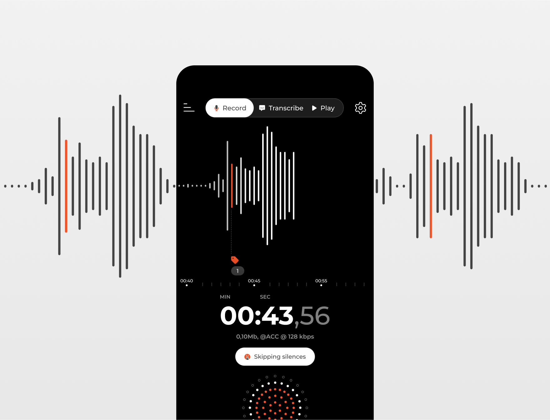
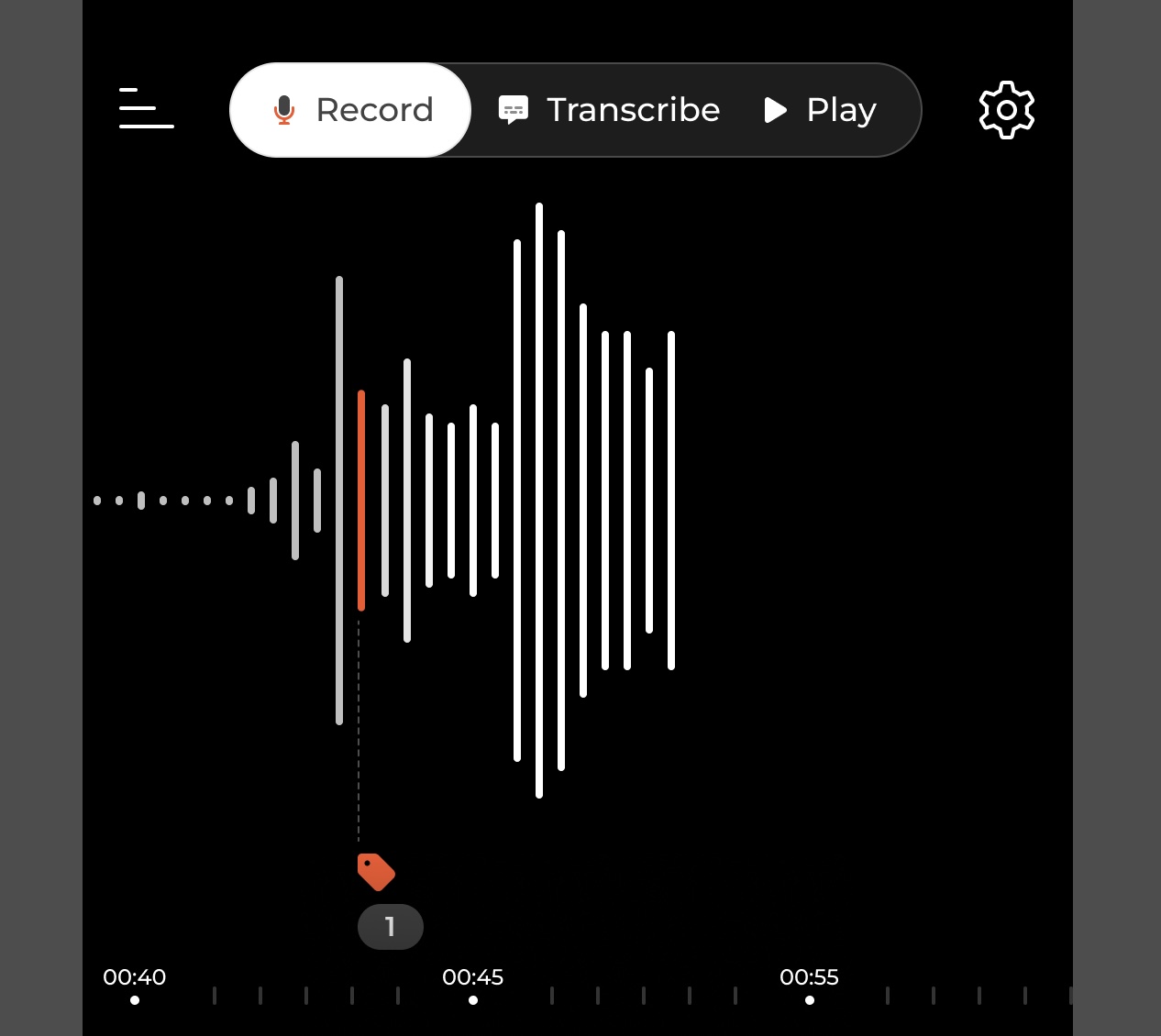
The Record feature provides users with the ability to capture their voices. Down below you can see the final look of the "Record" screen.
As you explore further, you will find in-depth explanations of our design decisions and the problem-solving strategies employed.
The recorder design is intentionally kept simple, featuring basic controls such as play/pause and a timer display. In addition to these core functionalities, the client's requirements included:
- An animation to indicate that a recording is in progress.
- Retaining existing extra features like "Skip silence" and the voice intensity display (a large round item with dot patterns).
- Adding a labelling feature to mark specific sections of the voice message.
To enhance the user experience further, I conducted research on user needs and decided to incorporate additional information on the screen, while still maintaining a minimalistic approach. These additions address the following insights:
- Users often record for music-related purposes, interviews, or voice memos. They rely on sound quality to achieve their goals. Therefore, it is crucial to provide information about the recording format and its impact on file size.
- To reinforce the feeling of recording initiation, a timeline is added alongside the duration indicator. This helps users track the progress of their recording.
- Considering the labelling feature, it is important to provide an indication of the approximate position of each label on the timeline. This aids users in locating specific points of interest within the recording.
Based on the provided information, the initial home screen design could resemble the following sketch:
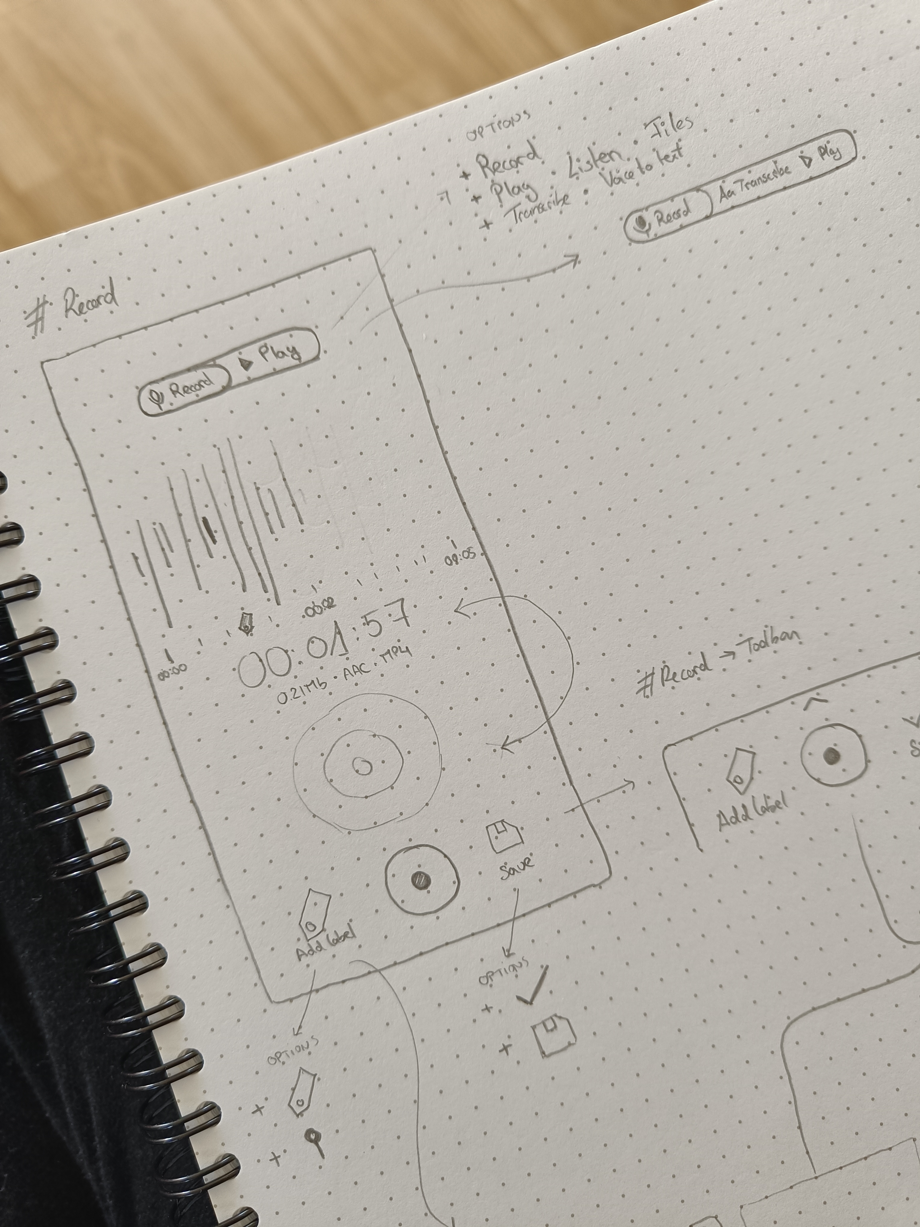
The comprehensive assembly consists of distinct areas on the recording screen:
- Animated and Interactive Area: Features visually engaging bars representing the voice level and a timeline to track the progress of the recording.
- Time Counter and Additional Features: Displays the exact time duration of the recording, keeping users informed about the elapsed time. Its format is set to minutes:seconds:miliseconds by default, but it has enough space to fit hours if needed.

- Action Area: Enables users to initiate and pause the recording process.
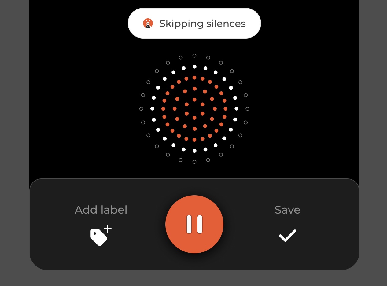
This composition ensures a dynamic and user-friendly recording screen, facilitating the visualization of recording progress, providing essential time information, and offering convenient controls for managing the recording.
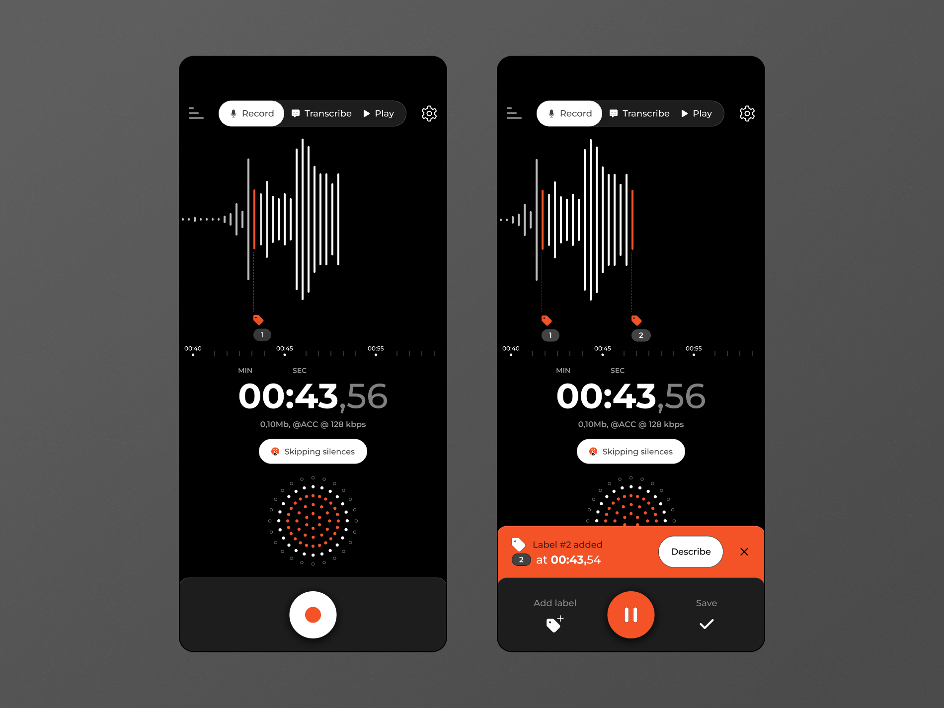
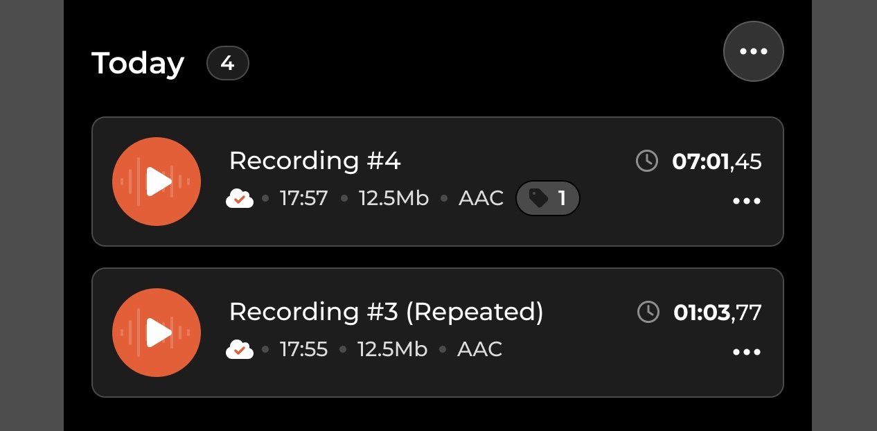
Adding labels
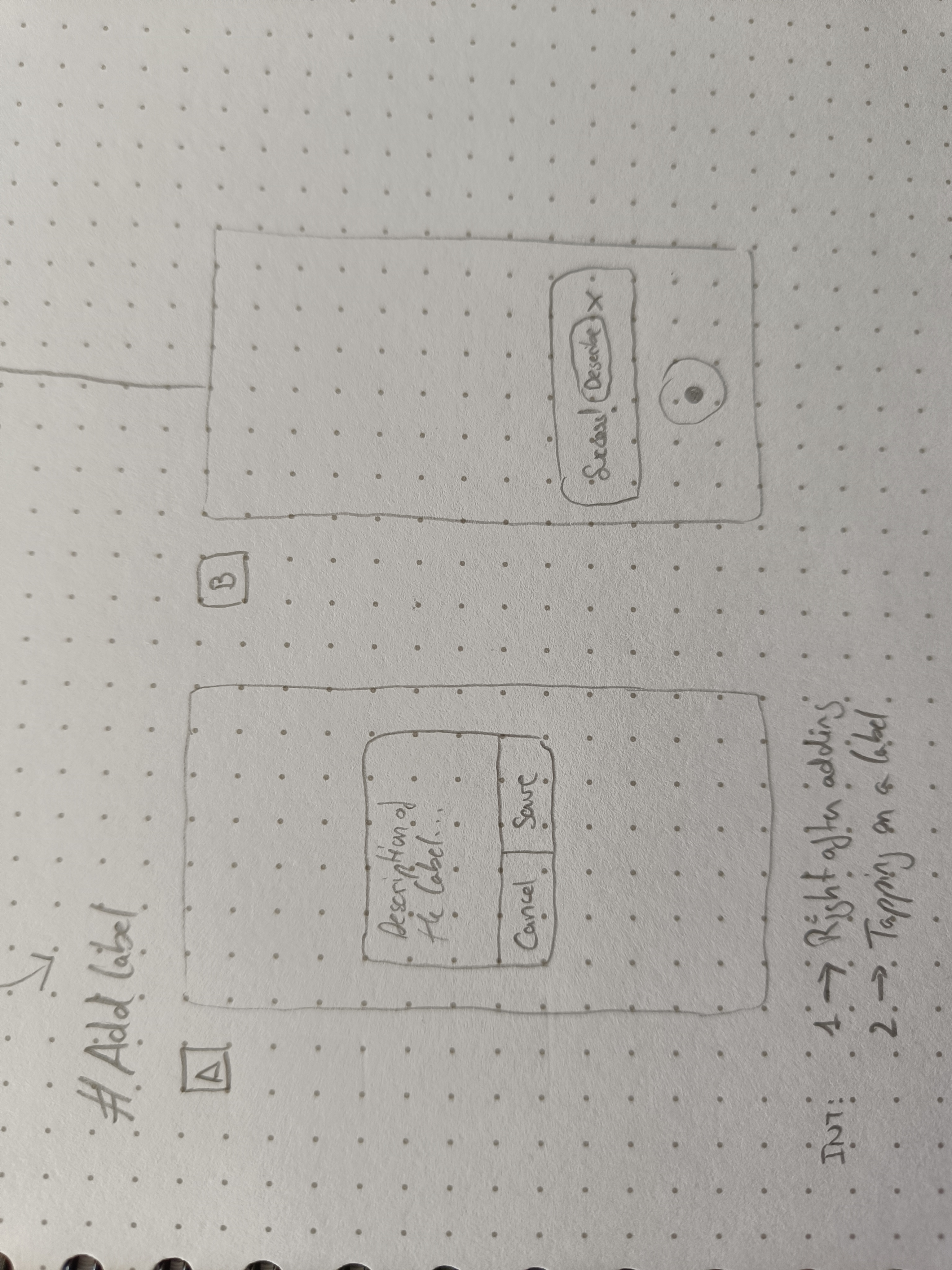
Labels are designed to assist users in finding specific sections within their voice memos. They serve as markers to remember key points or content in the recording. To enhance the labelling process, there are options available once the "Add label" button is pressed:
- Popup Modal: A small popup window appears, prompting the user to provide a text description for the label. This approach is commonly seen in competitor apps but may disrupt the user's flow visually.
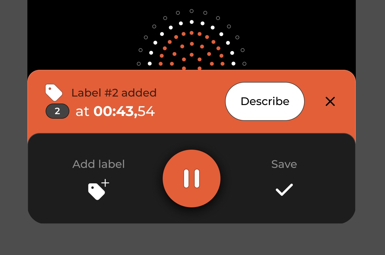
- Non-visually-invasive Option: Users can choose whether to add a description immediately or later using a less obtrusive method. This can be achieved through a small toast notification positioned above the record button. The toast informs the user that the label has been placed and provides an option to describe it by tapping a dedicated "Describe" button.
These options aim to strike a balance between providing the necessary functionality and minimizing disruption to the recording process.
To proceed, the selected option is the non-visually-invasive method. To seamlessly integrate it into the current design, certain UI adjustments were made. Instead of a toast that appears abruptly, the bottom area of the screen has been transformed into a toolbar.
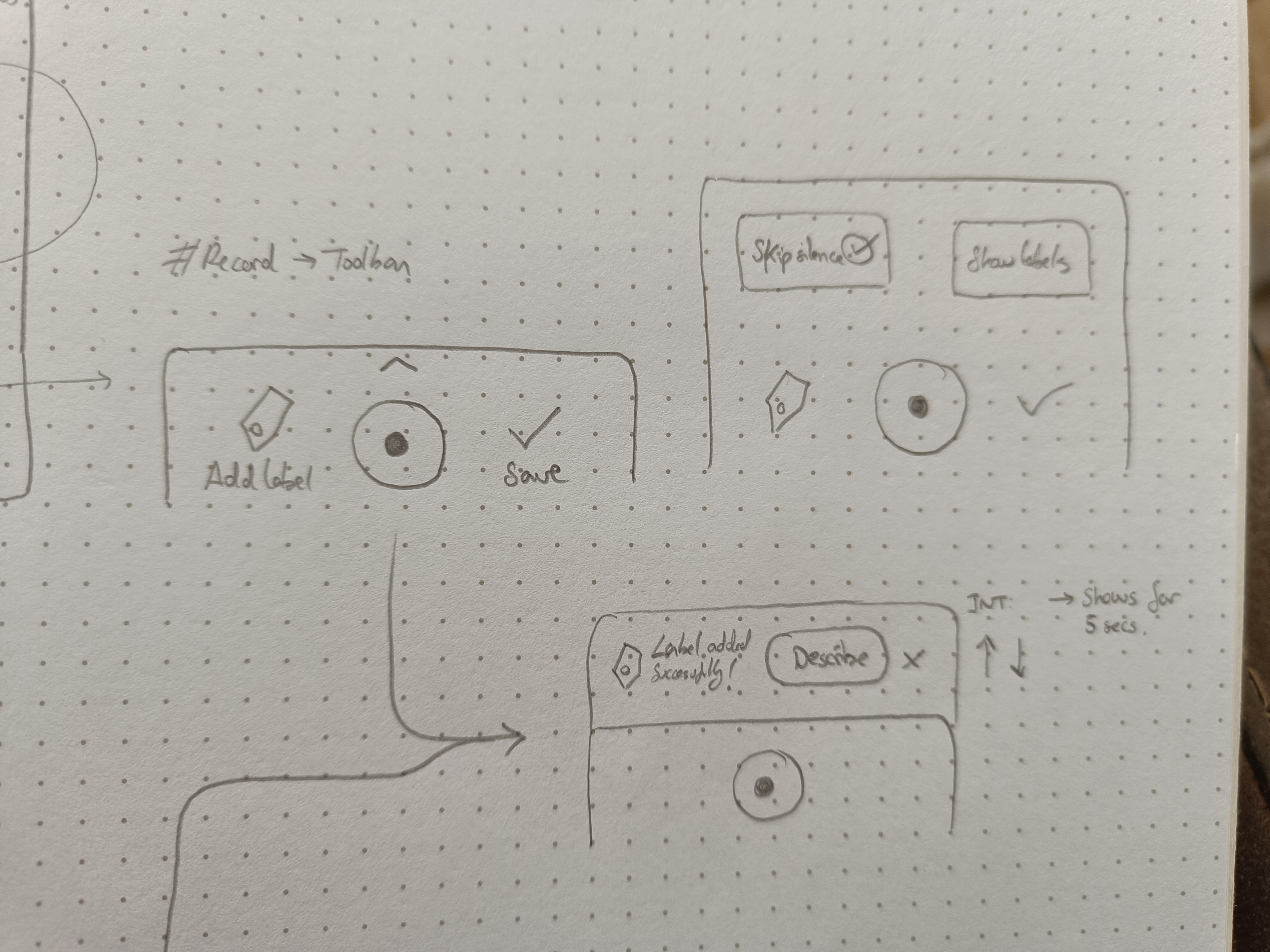
The new toast now emerges from beneath this toolbar, maintaining a cohesive and integrated visual experience. This approach ensures that the labelling feature harmoniously blends with the overall UI design, enhancing the user's interaction with the app.
Toolbar
To consolidate secondary features like adding silences and managing labels, a toolbar was implemented. The toolbar can be expanded by tapping a small arrow on top of it or by dragging it up. However, due to the complexity of the area, a decision was made to relocate its contents to an auxiliary "settings" menu located at the top of the screen. Typically, this is where the "ellipsis" icon, indicating additional menus, is placed.
The inclusion of the toolbar not only facilitated the appearance of the label toast from underneath but also provided a visual division among the various elements on the screen. This prevented them from appearing as if they were floating in an empty white space. The toolbar served both functional and aesthetic purposes, improving the overall user experience and enhancing the visual organization of the interface.
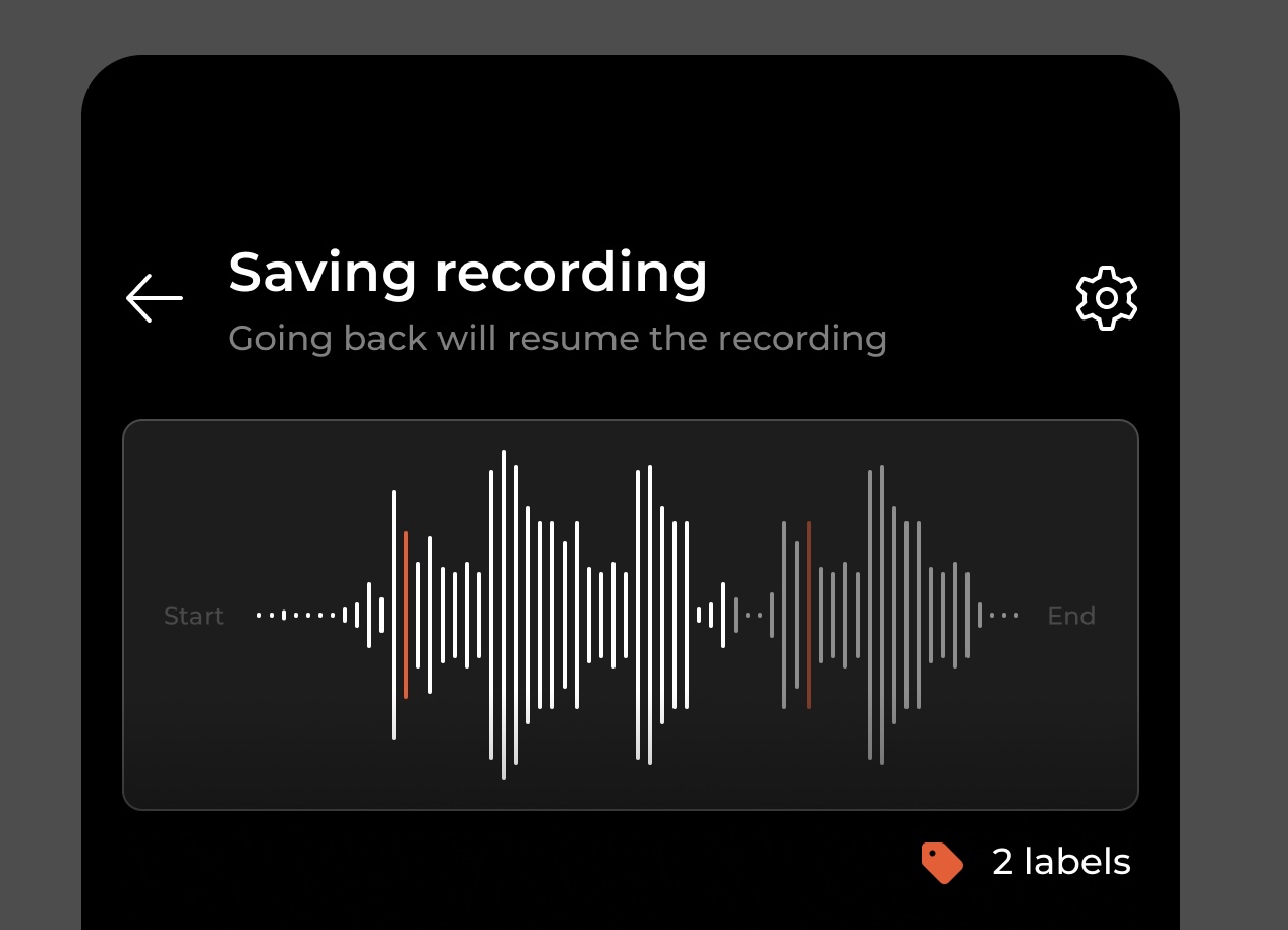
2. Saving the recording
Upon completing the recording, a screen for saving the recording becomes essential. To convey the sense of a final product, a miniature representation of the audio has been incorporated at the top of the screen. This area serves as a visual preview.
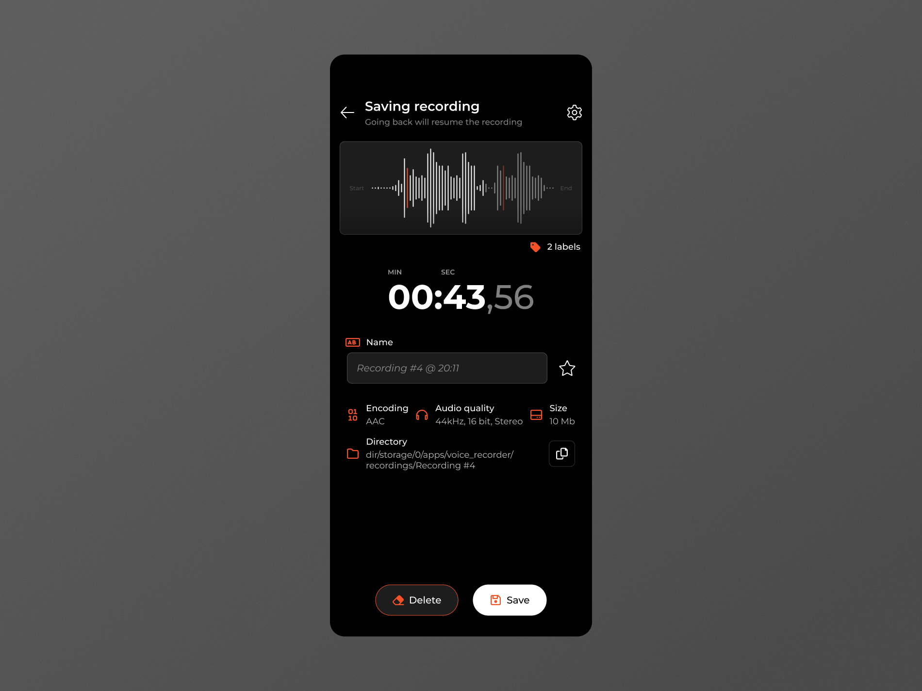
To minimize the risk of accidental taps, the back arrow has been positioned at the top of the screen. Its purpose is clarified to ensure that this action returns the user to the recording screen without discarding any recorded content. This design decision addresses the common issue where users feel disappointed upon returning from the screen and finding that their recording has been lost.
Additionally, the top section of the screen provides a comprehensive summary of the saved recording, including:
- Duration: The length of the recording.
- Size: The file size of the recording.
- Encoding: The format in which the recording is saved.
- Location: The storage location of the saved file.
- Number of Labels: The count of labels associated with the recording.
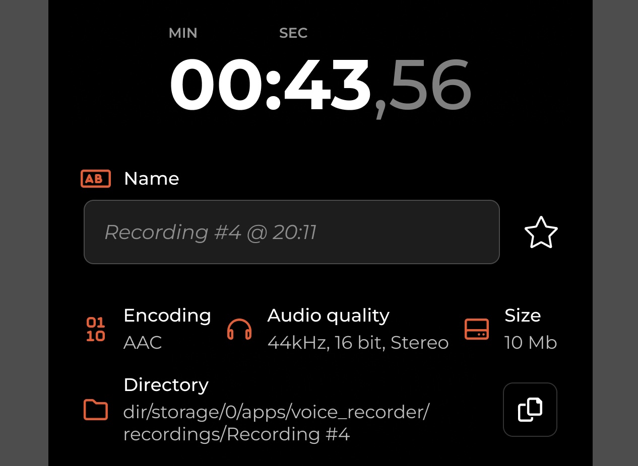
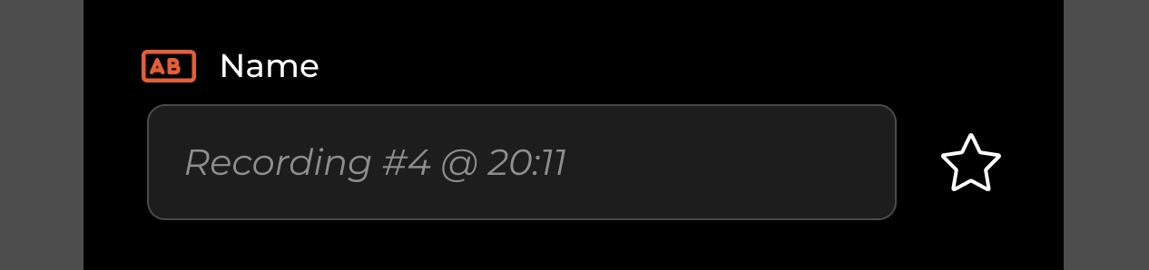
To enhance personalization, a custom name field has been incorporated into the interface, enabling users to assign a specific name to their recordings.
To facilitate user interaction, this area now also includes an "Add to Favorites" button, represented by a star icon. Placing the button adjacent to the custom name field emphasizes its purpose, allowing users to easily associate it with taking action on their recordings. This placement reinforces the notion that this particular area is where users can perform various actions related to their recordings.
The strategic placement of the input field at this level is intentional. Considering that the keyboard is expected to occupy the lower part of the screen, the Delete/Save buttons will be automatically adjusted upwards by the appropriate amount. This adjustment ensures that the essential components, namely the input field and action buttons, remain visible despite the presence of the keyboard.
3. The player
Continuing with the logical order, let's delve into the explanation of the "Play" menu, as it is closely related to saving a recording.
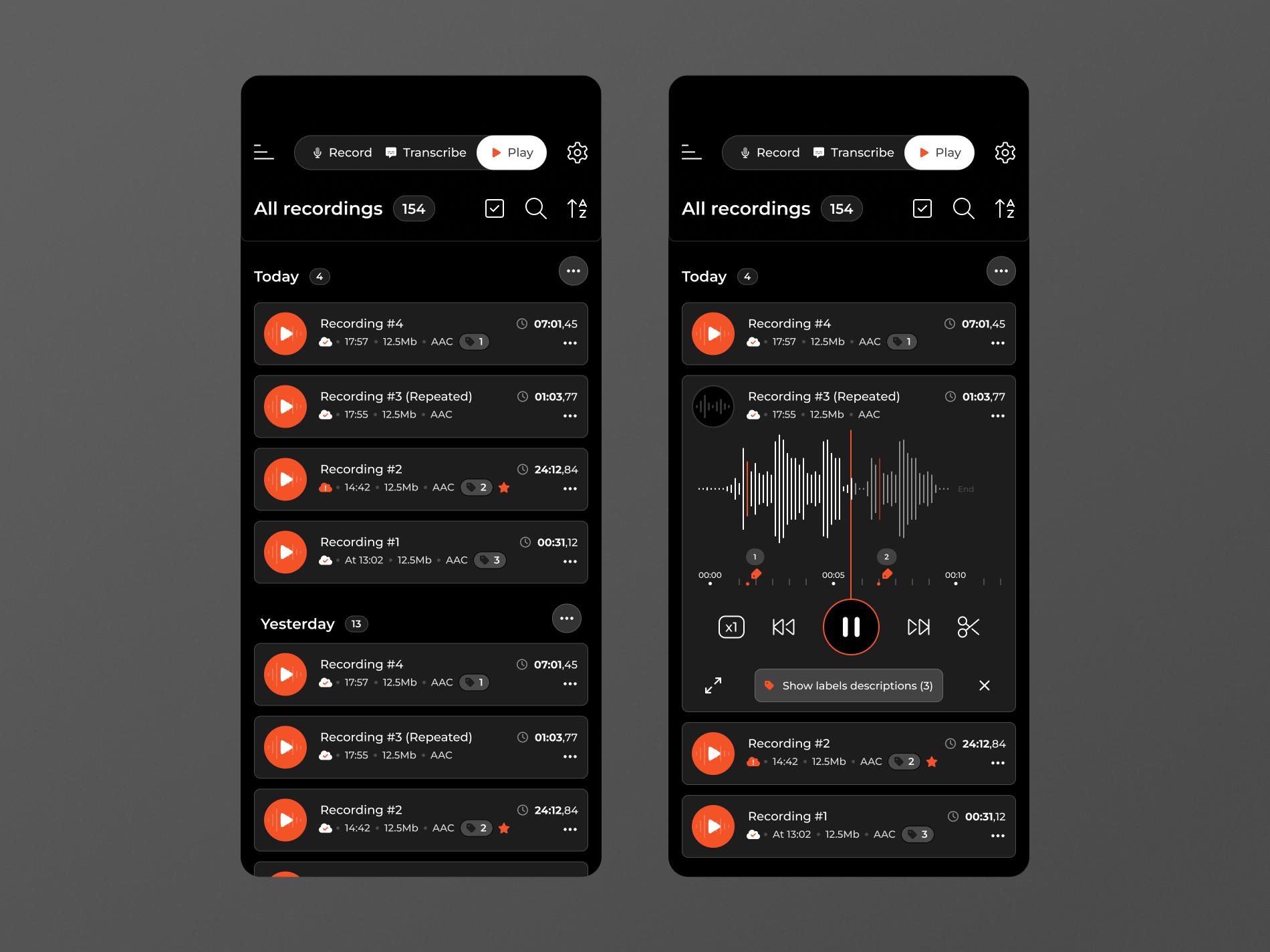
The "Play" menu serves as a centralized hub for storing all recorded audio. It features a straightforward list view that incorporates various actions commonly associated with lists. These actions include filters, multiple-selection options, sorting, and search functionalities.
Individual recordings
In the "Play" menu, individual recordings are displayed and grouped chronologically. Each recording shares the same set of information, including:
- Name: Crucial for efficient recording management. If left empty, the app automatically assigns a name based on the time and date of the recording. However, the app provides a warning to ensure important recordings are not left unnamed.
- Metadata: This includes details such as the time of the recording, duration, number of labels, size, and encoding format. These metadata elements provide valuable information about each recording, facilitating organization and selection.
- Sync Indicator: An indicator is present to show whether a recording has been successfully synced with the cloud. This feature helps prevent data loss and ensures that recordings are securely backed up.
By presenting this consistent set of information for each recording, users can easily identify and manage their recordings effectively within the "Play" menu.
When a recording is tapped, it expands to reveal additional information. Tapping on the play icon (highlighted in red on the left) triggers the same expansion but also starts playing the audio.
The expanded view of the recording includes the same set of information as the collapsed view. Additionally, an audio player with essential controls is present, allowing users to play, pause, and control the playback of the recording.
4. The transcriber
The second key feature of the app is voice-to-text transcription, which operates differently from simple recording and saving.
This feature enables users to record their voice, convert it into text, and construct a narrative. As a result, there is no need for a dedicated saving location like the recordings under the "Play" menu.
The workflow for this feature follows these steps:
- Tap the button to start recording.
- The voice is processed and transformed into words.
- The words are added to a text list, forming the narrative.
This approach introduces natural steps between recordings, allowing users to navigate back and forth, undo and redo portions of the text. This workflow enables users to build and refine their narrative by seamlessly combining recorded voice and converted text, enhancing the overall transcription experience.
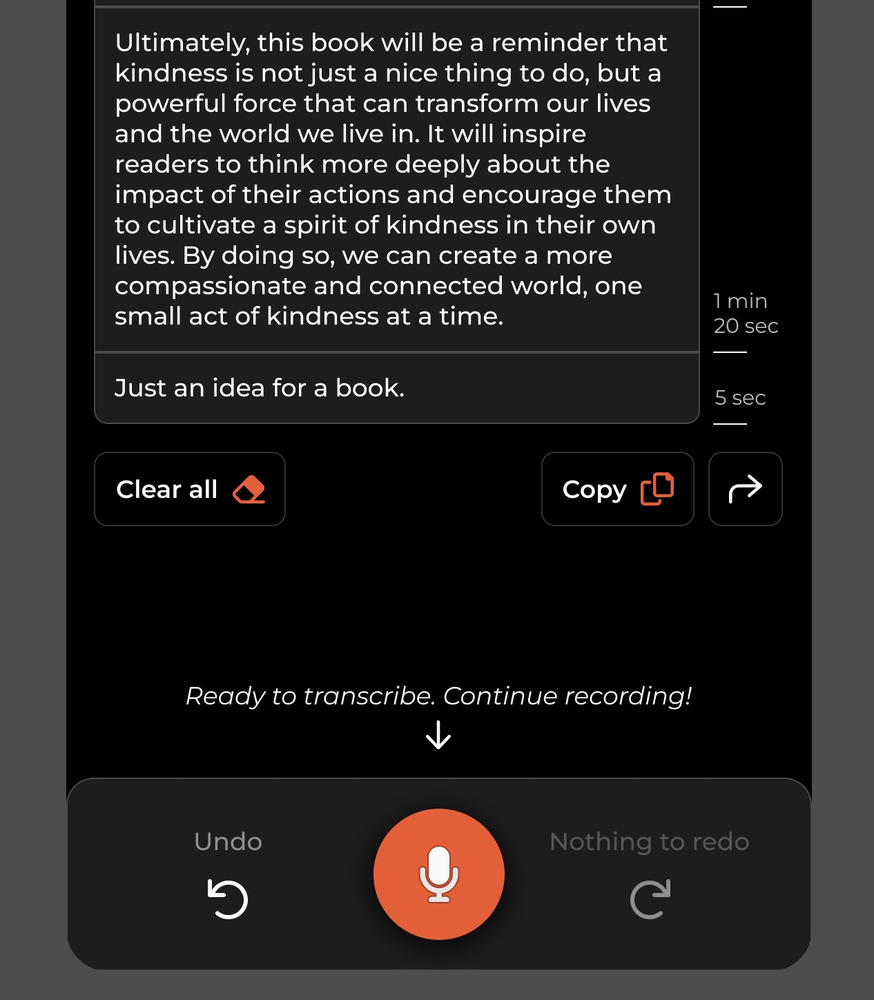
In this case, the icon used for recording has been updated from a circle, which is traditionally associated with recording, to a microphone icon. This change aligns with the prevalent use of microphone icons in modern apps, particularly for voice recognition and queries. By utilizing a recognizable microphone icon, it becomes easier for users to identify and associate the icon with voice-related functionalities within the app.
The final result
Here you'll find our app's finished designs. We're excited to share the final result with you and hope you'll love using our app.